It was just a colour out of space—a frightful messenger from unformed realms of infinity beyond all Nature as we know it; from realms whose mere existence stuns the brain and numbs us with the black extra-cosmic gulfs it throws open before our frenzied eyes.
—H. P. Lovecraft, “The Colour Out of Space”
Comic and graphic novel adaptations of prose and verse literary works have always held a fascination. Because while you might declare one text as canonical, as a true text, immutable and eternal, the graphic adaptations of that text will always be different, unique to their vision and skill and ability to realize that text in illustrated form. Every artist has to pick and choose what images to convey and how to convey them, how to frame the story and the text, what to leave in and out, what to emphasize and how to do it. Give three artists the same story to draw, and you have three variations on the same story.
This sometimes arouses—at least among some readers and critics—the urge to compare different variations on the same works to each other. Because it can be fascinating to see the divergence and the commonalities, to look at all the different flowers that may blossom from identical seeds. Not necessarily to point out any one graphic adaptation of Lovecraft as better than the others, but to enjoy the diversity of views and skills.
When it comes to “The Colour Out of Space” in particular, however, there’s a fundamental question that every artist has to struggle with: how do you depict a color that is outside the visible spectrum?
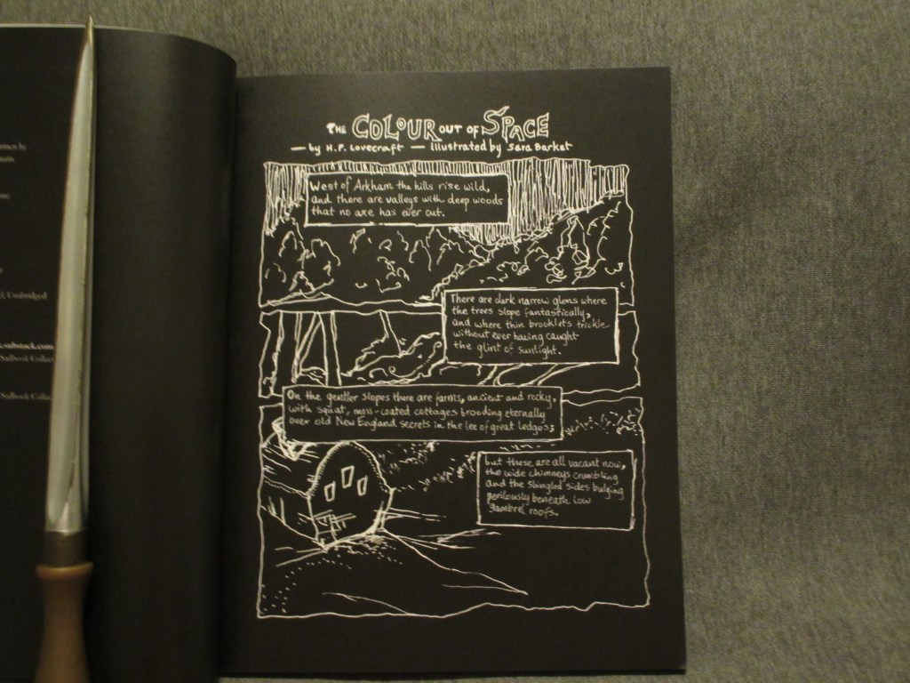
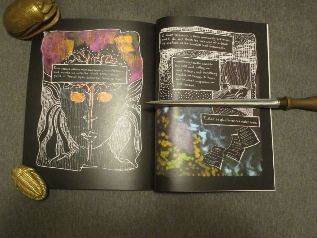
Strictly speaking, outside of a technical trick like polarized lenses, you cannot. What usually happens instead is that the artist has to use visual rhetoric to convey the sense of the unknown color, even while using the colors that are available for printing. In the case of Sara Barkat’s The Colour Out of Space (2024) this is mostly accomplished by having the majority of the art in black-and-white.
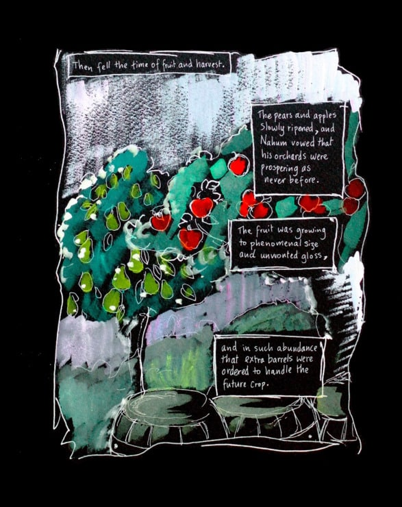
However, instead of having the colored portions represent just the color itself, the color is used to illustrate those people and objects that the color has infected. So the addition is not just a single splash of magenta or red in a monochrome world, it is a spectrum of colors in a landscape, or a room, or a person.
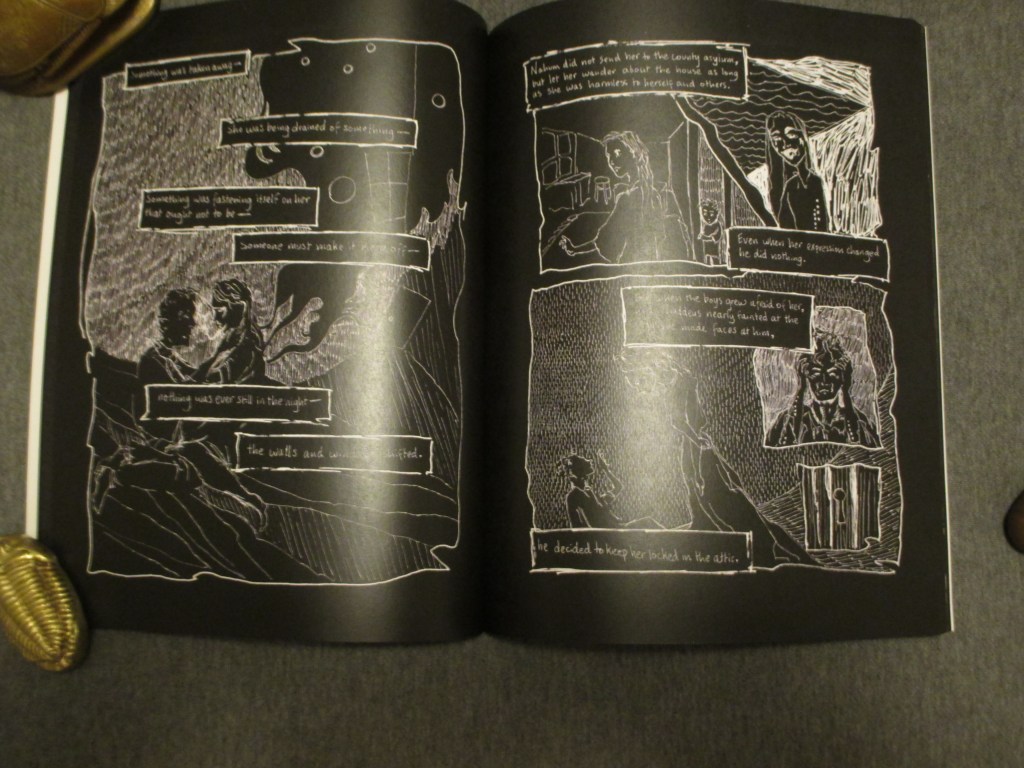
Barkat’s style isn’t a demonstration of technical excellence in the same sense of Gou Tanabe’s The Colour Out of Space (2025), nor does it have the minimalist book-as-object approach of Amy Borezo’s The Colour Out of Space (2016). What she has is a loose, sketchy but heavily detailed pencil that captures a certain underground aesthetic, the rawness of the art adding a certain texture to the text, especially with the use of mixed media (primarily watercolors) to add color. As with Alberto Breccia’s Cthulhu Mythos adaptations, the result is a more profound experience than either the art or the text would accomplish on their own.
Which is ultimately what a lot of people are looking for in any graphic adaptation. Not a simplification of a text, or the addition of some pretty pictures to look at, but a new way of experiencing the story.
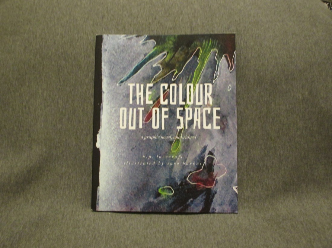
The Colour Out of Space (2024) by H. P. Lovecraft and Sara Barkat was published by T. S. Poetry Press. Barkat’s other works include a graphic adaptation of The Yellow Wallpaper (2020) by Charlotte Perkins Gilman and Drawing Dracula Daily (2023).
Bobby Derie is the author of Weird Talers: Essays on Robert E. Howard and Others and Sex and the Cthulhu Mythos.
Deep Cuts in a Lovecraftian Vein uses Amazon Associate links. As an Amazon Associate I earn from qualifying purchases.
