
In 2016, artist Amy Borezo published a very limited illustrated edition of H. P. Lovecraft’s story “The Colour Out of Space.” To quote from Shelter Bookworks’ original page:
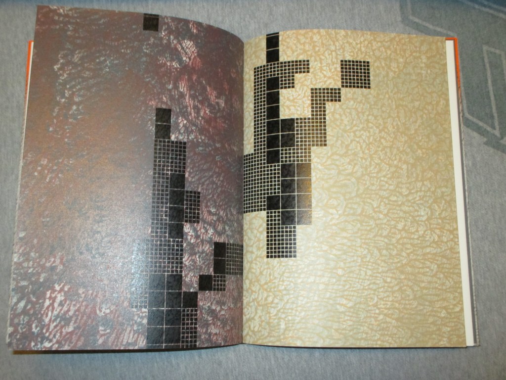
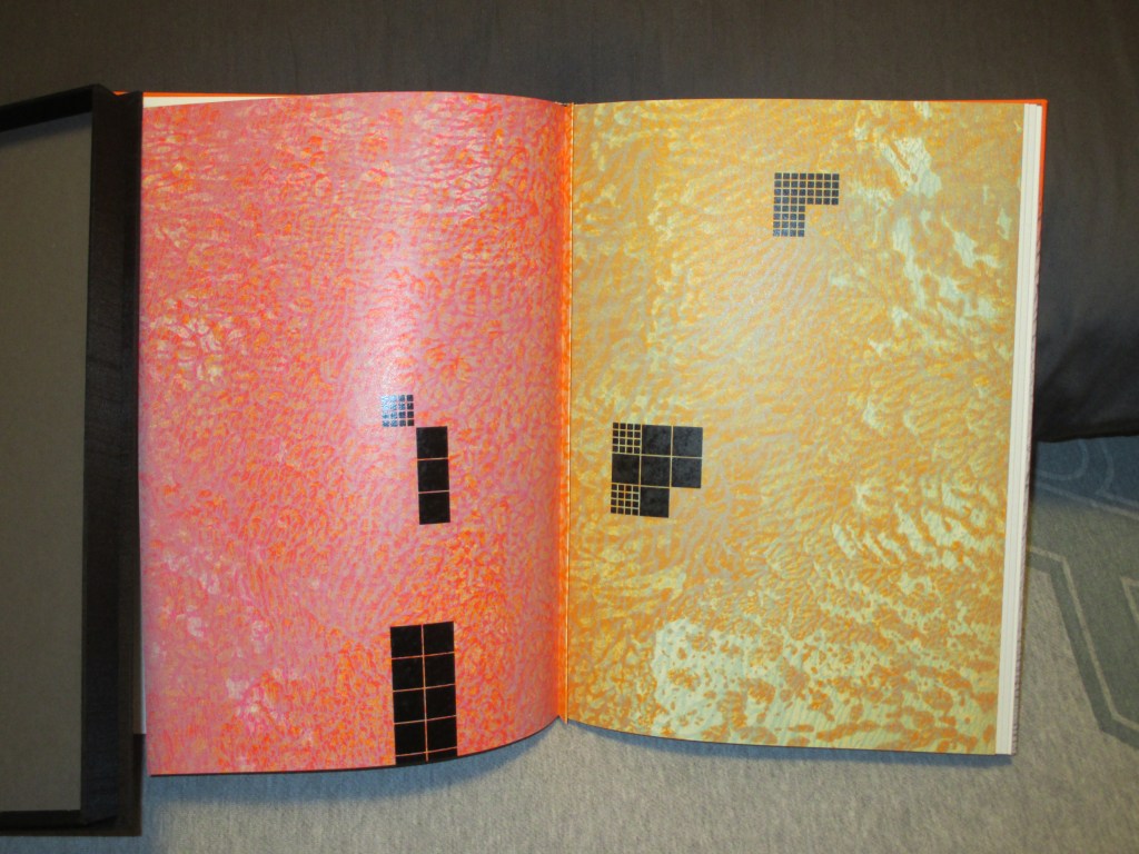
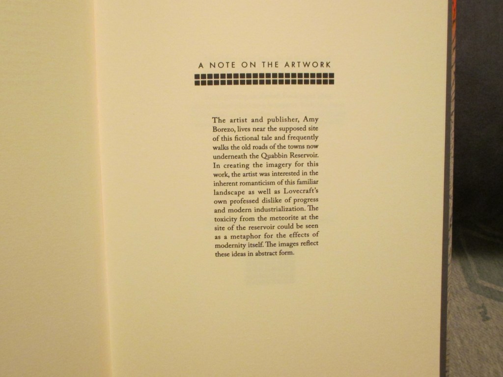
This hybrid artist’s book/contemporary fine press edition of the 1927 horror/sci-fi story by HP Lovecraft includes an introduction by Lovecraft scholar S.T. Joshi and 14 color images by Amy Borezo. The artist lives near the supposed site of this fictional tale and frequently walks the old roads of the towns written about in this story. In creating the imagery for this work, the artist is interested in evoking the complexity of the local landscape in abstract form with the construction of the reservoir overlaid visually through geometric blocks.
The text for this edition was provided by S.T. Joshi from his recent publication, H. P. LOVECRAFT: COLLECTED FICTION: A VARIORUM EDITION [Hippocampus Press, 2015] and is derived from a typescript at Brown University, evidently prepared by F. Lee Baldwin for a proposed reprint of the story (c. 1934) that never happened. It has some revisions in pen by Lovecraft, so presumably it represents his final wishes for the story.
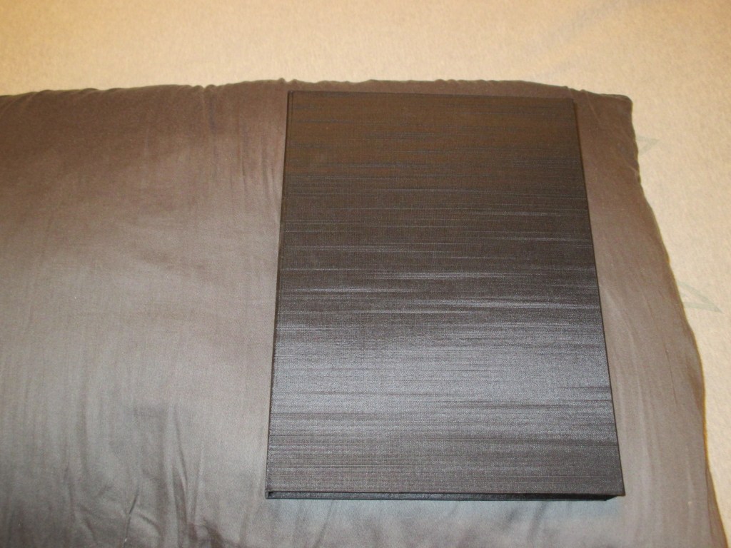
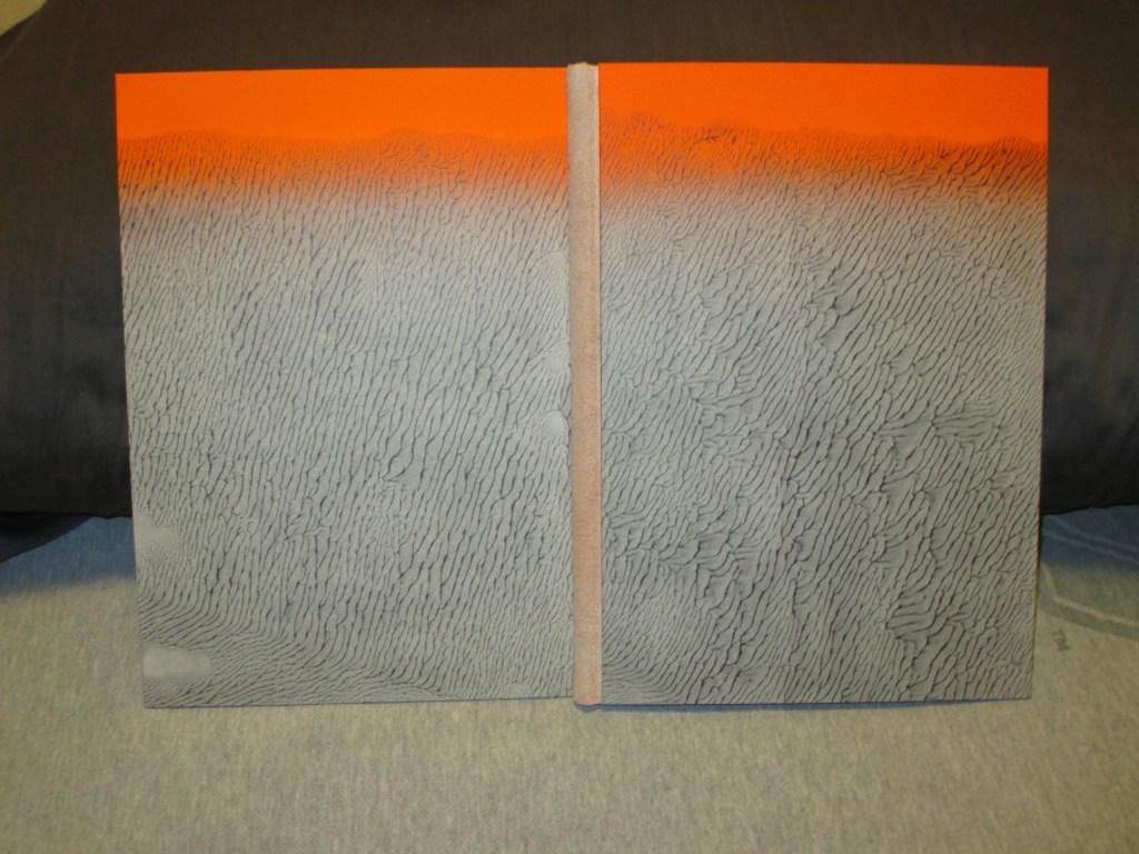
_____________________Relief printing on Zerkall Book paper from photopolymer plates on a letterpress. Body text set in Caslon, titles in Futura. Pages sewn onto a shaped concertina. Paste paper over boards with a buffalo suede spine. Housed in a presentation box. Special thanks to Lisa Hersey who assisted in printing and binding.
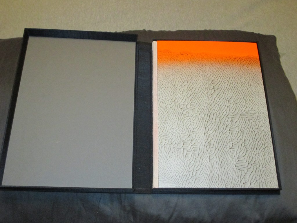
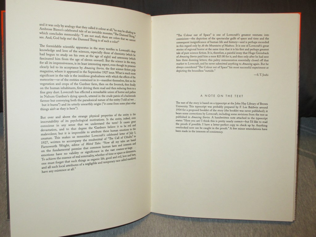
The edition, despite the relatively high cost (US$500 + shipping in 2016), sold out. It arrived in an attractive clamshell box, with a paper label. Inside, the colors on the paper are bright and vivid in a way that the light and the camera don’t really catch, the backstrip soft, the paper creamy and the text sharp. In your hands, the brilliant orange seems to leak through around the edges of the pages. A title page, a brief introduction by S. T. Joshi. The text and illustrations are on alternate pages, distinct, the images vivid but abstract. A word on the artist, a colophon and numbering page, and then the book is at an end.


Amy Borezo’s illustrated edition is, in a very real sense, a piece of art that you can read. The text itself is meticulous in its accuracy, but you can read the same text in Hippocampus Press’ variorum edition, you can read the same text for free online. If you must have a physical copy of a book in your hand, you are spoiled for choice: “The Colour Out of Space” is one of Lovecraft’s most reprinted works, and there are innumerable illustrations for the story from various artists, from J. M. de Aragon in the pages of Amazing Stories in 1927 and Virgil Finlay in Famous Fantastic Mysteries in 1941 to many others of the current day.
This massive plurality of choice, the sheer number of editions, touches on an issue that many readers and would-be readers of Lovecraft deal with: where do you start? What is the best edition? What if you want a really nice copy of a book? Which one of all the hundreds of titles should you go for, and why, and how much will it cost?
If that sounds like more of a collector’s issue than a reader’s issue, then congratulations, you’ve hit on one of the fundamental problems facing not only Lovecraft, but most popular authors in the contemporary period.
When Lovecraft was alive, he was primarily published in the amateur press, pulp magazines, some reprint anthologies like the British Not at Night series, and a couple of very small privately printed editions of The Shunned House (never bound or formally released during his lifetime) and The Shadow over Innsmouth (which was, but the binding was shoddy). There were no finely bound editions of Lovecraft with the embellishments of the bookmaker’s art available to the general public, no leather covers, no gilt lettering, no raised bands (caveat: one copy of The Shunned House was specially bound by R. H. Barlow as a gift for Lovecraft).
Early collectors of Lovecraft often focused on posthumous publications, like the first publications of Arkham House, and little obscurities like the edition of Lovecraft’s commonplace book put out by the Futile Press in 1938. Even ultra-small press editions were typically not “fine” in the sense of lavish materials, artwork, or presentation, but were often considered valuable simply because of the small size of their edition, the ease with which copies perished, and subsequent rarity in the face of growing demand. That demand came from Lovecraft’s own growing popularity; the mass market paperback reprints of Arkham House collections, the armed services editions, and foreign reprints in hardback and paperback vastly increased the audience for Lovecraft’s work.
Until quite recently, fancy fine press editions were not normal for living authors. Before mass literacy, books were often bought unbound and then the author could bind them however they liked; really rich people could commission books that were themselves works of art in every sense of the word, involving whatever costly materials or decorations they cared for. As the commercial basis of book reading and publishing became more egalitarian, fancy editions often became more about the skill of the bookmaker and/or any associated artist, for fine press editions, and the materials shifted.
So when you look at what constituted a really nice Lovecraft edition in, say 1980, you’re likely looking at the output of Roy A. Squires’ press. These were meticulously crafted letterpress editions, usually on high-quality handmaid paper, sometimes featuring tipped-in photographs or other illustrations. Where a normal chapbook from Necronomicon Press or a fan press might be published on an Apple II printer and stapled together, everything about Squires’ production was done by hand.
The slightly bourgeoisie desire for something fancier still nagged the science fiction and fantasy market. Arkham House paved the way in the late 1930s and 40s by showing that a small press publisher specializing in genre books was viable (the presses they inspired apparently didn’t know how often Arkham House founder August Derleth was running in the red, or how long it took for his small, relatively expensive books to sell). Most of these products weren’t fine press; they were solid books, aimed and priced at a select market. Very few of them produced anything that might be described as a luxury edition of Lovecraft; the choicest example might be the 1976 edition of Démons et Merveilles by French publisher Opta, which came bound in leather, with slipcase, and illustrations by Philippe Druillet. The translation has its issues (Lovecraft’s “ghouls” is rendered as “vampires,” to give one notable example), but compared to the rather plain but sturdy Arkham House editions, it’s gorgeous.
Easton Press (founded in 1975 as a division of MBI, Inc.) took up the gauntlet of producing, for lack of a better term, what not-rich people think of as rich people’s books: bound in leather, embossed in 22k gilt, very snazzy to look at. In practice, while Easton Press has consumed many acres of cowhide, the actual books they produce tend not to be very special: they’re reprints of existing books, often not anything particularly rare or obscure, with no additional editorial guidance or notes (and sometimes bad misprints). The books themselves are usually solid, but less than beautiful; their editions of Lovecraft show evidence of corner-cutting and mass production.
There is a niche market for really nice editions of books, at a price affordable to middle-class bibliophiles. Over the last twenty years or so, that niche market has exploded. Centipede Press, Subterranean Press, the Folio Society, etc. are names that are familiar now for deluxe editions of Lovecraft and/or other authors, typically reprinting older works instead of presenting anything original, and typically publishing in limited editions of a few hundred copies. Quality and presentation vary, although are generally pretty high—not quite the same production value as, for example, letterpress outfits like Pegana Press which continue the fine press tradition, but for high-end versions of books that you might otherwise buy at Barnes & Nobles…
…and that is kind of the rub. While there are some exceptions, most of these presses aren’t gambling on producing anything new. There might be new artwork, there might be a new introduction by Alan Moore or S. T. Joshi, but there is no experimentation, there is often nothing unique about these particular editions. There are some exceptions; Centipede Press has produced some original compilations like Conversations with the Weird Tales Circle that collects many rare, obscure, and out-of-print materials; and the art book A Lovecraft Retrospective is pretty much unparalleled. Helios House Press has published some original scholarship among the reprints (full disclosure: they’ve paid me for a few essays and other work).
For most of these companies, however, the text itself isn’t special. The production quality might not be much better than any other mass-produced hardcover. They might be pretty, but from a strictly objective standpoint they don’t offer much new or exciting. They’re just very expensive.
So what exactly are you, the reader, paying for?
Which is what you need to answer for yourself. If you’re a scholar or academic looking for a text that’s pure Lovecraft, you’re probably better off buying the Hippocampus Press variorum editions. If you’re a casual reader, the Penguin paperbacks are cheap and almost as good. If you’re a poor student, stick to the online editions at https://hplovecraft.com. If you want a fancy edition…well, you’ve got options. Lots of them, for every price point. Handmade Japanese paper, bound in leather, with silk bookmarks, signed in blood.
It’s all available for the right price.
So what sets Amy Borezo’s book apart? Normally, based on the materials, the quality of the printing and craftsmanship, I would qualify this as a fine press product. However, in the marketing, the presentation, this is a little different. It is a book, and can be read as a book, but it is also a work of art, and can be experienced and appreciated like buying a lithograph print from a series. If you’re a fan of Lovecraft, you know the words, you’ve read the story a hundred times. Many artists have tried to capture a colour that lies beyond human perception, to depict the events of the story in some fixed form. Only Borezo has gone to such effort to capture that feel in an entire book production, not just as isolated images.
The beauty of Borezo’s art is that it is abstract; it doesn’t try to impose meaning on the text, readers have to stare at it for themselves. Some might not like it, others might get it but not care for the idea, but for me there’s a certain tactile experience with that nearly radioactive orange that seems to seap through and around the pages at times. Yes, it could just be the collector in me, trying to justify the hundreds of dollars this book cost, but in a real way that is the experience we buy with every book, above and beyond the text itself. The feel of it in your hands, the smell of the paper, the crackle of the spine. It’s different, when you’re holding an old pulp whose brittle and yellowed pages are as fragile as a papyrus from a mummy’s tomb, or an old worn paperback whose tanned pages are as soft as toilet paper, or a crisply printed new edition with ink that almost looks still wet.
From a scholar’s perspective, from a historian’s perspective, the focus is usually on the text, not necessarily the visceral experience surrounding how the text is read and received. Yet it is important not to lose touch with that. In an age where Lovecraft is in the public domain, generative AI, and print-on-demand publishing, we are going to see a vast proliferation of books—many of which are going to be strictly hypothetical until someone orders them—and our eyeballs will see cover art generated by some pseudointellectual property theft engine and with text scraped off of somewhere online (errors and all), and pre-packaged to try and appeal to someone that wants to read Lovecraft—and whatever the end product is, the one thing I can guarantee is that it is not going to be anything like Amy Borezo’s edition of The Colour Out of Space.
Bobby Derie is the author of Weird Talers: Essays on Robert E. Howard and Others and Sex and the Cthulhu Mythos.
Deep Cuts in a Lovecraftian Vein uses Amazon Associate links. As an Amazon Associate I earn from qualifying purchases.

This was FIRE! 🔥 So well said!
LikeLiked by 1 person