Deeper Cut: Lovecraft & Hokusai

As reckoned among the race-stocks of the world, the Indian is certainly not inferior. Neither, for that matter, is the Mongolian race as a whole. It is simply our reaction against the alien and the unaccustomed—together with the circumstance that our immigrant specimens are generally of a low type—which causes us to look down on the Chinese and Japanese. Both of these races, as rationally judged by their history, literature, philosophy, and art, are among the superior biological focus of the planet—and no one who is acquainted with their better classes is ever able to retain that feeling of repulsion which the ordinary American, Australian, or New-Zealander usually feels.
— H. P. Lovecraft to Robert E. Howard, 7 Nov 1932, A Means to Freedom 1.481-482

The 1853 Perry Expedition forcefully ended Japanese political isolation, and during the 19th and early 20th centuries cultural and technological exchanges with the rest of the world profoundly affected both Japan and the rest of the world. The Tokugawa Shogunate was overthrown, and a new government overtook Japan—one dedicated to rapid industrialization and militarization, which in practice meant increasing Westernization. The successful adoption of Western military technology and tactics became clear during the Russo-Japanese War (1904-1905), in which Japan’s surprise victory over Russia fueled racist fantasies of the Yellow Peril.

While Westerners feared the rising military might and aggressiveness of Japan, many were simultaneously drawn to Japanese art and culture. Japanese woodblock prints (ukiyo-e) covered a vast range of material, from purely ornamental to combinations of image and text that illustrated stories and scenes; from depictions of ordinary life and nature studies to erotica and supernatural creatures. Western interest in these woodblock prints is evident from before the U.S. intervention, but after trade was forcefully opened, the prints became much more accessible and inspired a Japonisme style in European art during the late 19th century, as well as collections and reproductions.

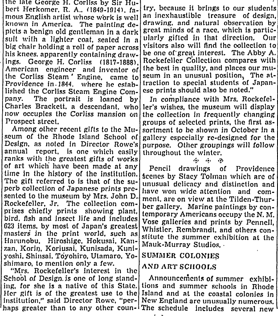
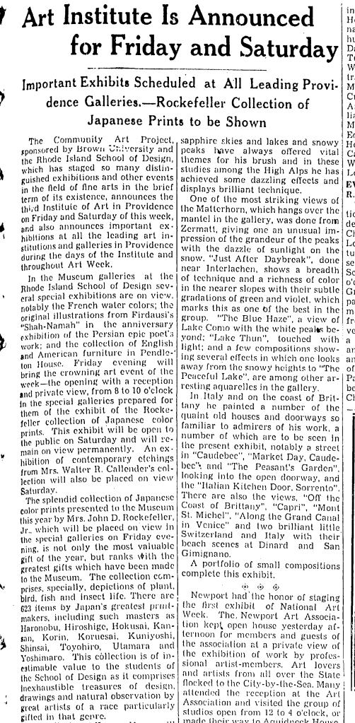
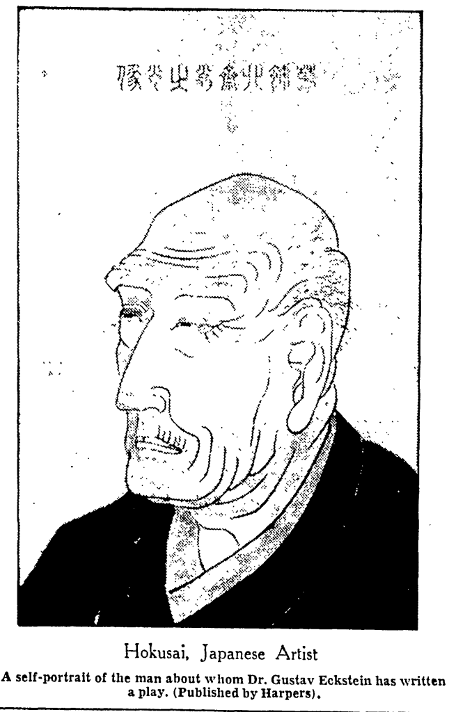
By the 1930s, Japanese prints collections were being displayed in U.S. museums, and the names of popular and notorious artists like Hokusai Katsushika (葛飾 北斎, 1760-1849) and Hiroshige Utagawa (歌川 広重, 1797-1858) were being bandied about by newspapers. In June 1934, Providence native Abby Aldrich Rockefeller (wife of John D. Rockefeller, Jr.) donated her collection of Japanese prints to the Rhode Island School of Design.

Japanese Prints Given by Mrs. Rockefeller, Jr.
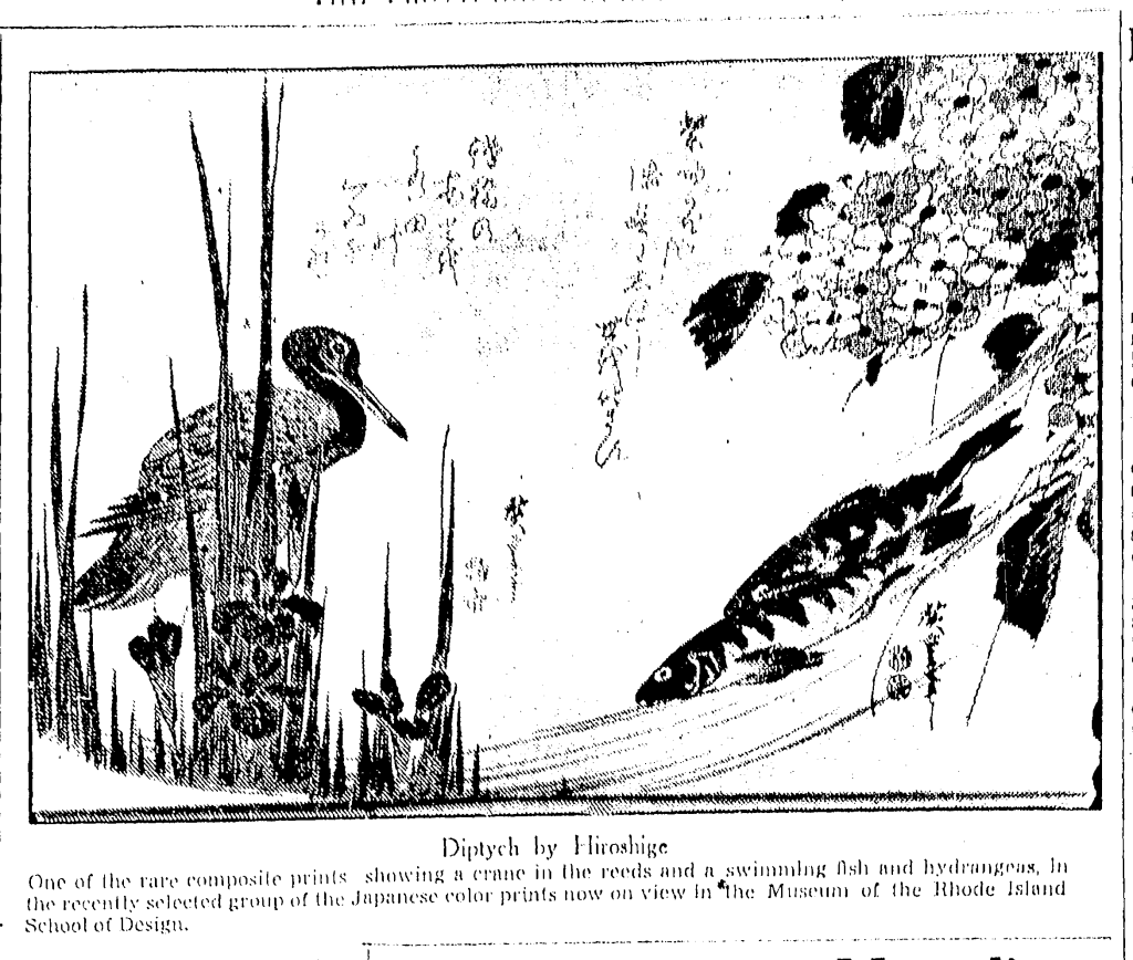
PROVIDENCE, R.I., June 7—(AP) The Rhode Island School of Design yesterday announced that a rare collection of Japanese prints had been presented by Mrs. John D. Rockefeller, Jr. The 623 prints, devoted chiefly to plant, bird, fish and insect life, are by the country’s greatest masters. L. Earle Row, director of the school museum, said that in accordance with Mrs. Rockefeller’s wishes the collection will be shown in selected groups changed at frequent intervals.
Springfield (MA) Evening Union, 7 Jun 1934, p13

That is where and how H. P. Lovecraft came to be familiar with Japanese prints.

Another event was the display of the choicest of the 717 Japanese prints just acquired by the local art museum. This is a really important accession—placing our museum in competition with Boston’s . . . . which boasts of having the finest Japanese print collection outside of Japan itself. The Providence collection is of the first quality, involving large numbers of items by Hokusai, Hiroshige, & kindred standbys.
—H. P. Lovecraft to Richard F. Searight, 22 Dec 1934, LPS 343

Another event was an exhibition of Japanese prints—part of 700 magnificent specimens (Hokusai, Hiroshige, & all the rest) just acquired by the local art museum. This acquisition will bring Providence into competing distance of Boston—whose Museum of Fine Arts boasts the finest collection of Japanese prints outside of Japan itself.
—H. P. Lovecraft to August Derleth, 22 Dec 1934, ES 2.671

More or less joined to this “art week” stuff was the first display of a choice array of the 717 Japanese prints just acquired by the local museum. This gave me quite a kick, since I am rather an enthusiast concerning Sino-Japanese art. The prints are of the finest quality, with plenty of Hokusais & Hiroshiges. A couple of weeks ago an expert lectured on the making of Japanese prints, & exhibited some of the delicately carved blocks used in their preparation.
—H. P. Lovecraft to E. Hoffmann Price, 30 Dec 1934, LPS 159

It isn’t exactly clear when Lovecraft gained his appreciation of Japanese art, although it seems likely he would have encountered specimens among his visits to art museums in Boston and New York in the 1920s.

Providence Journal, 16 Feb 1935, p18

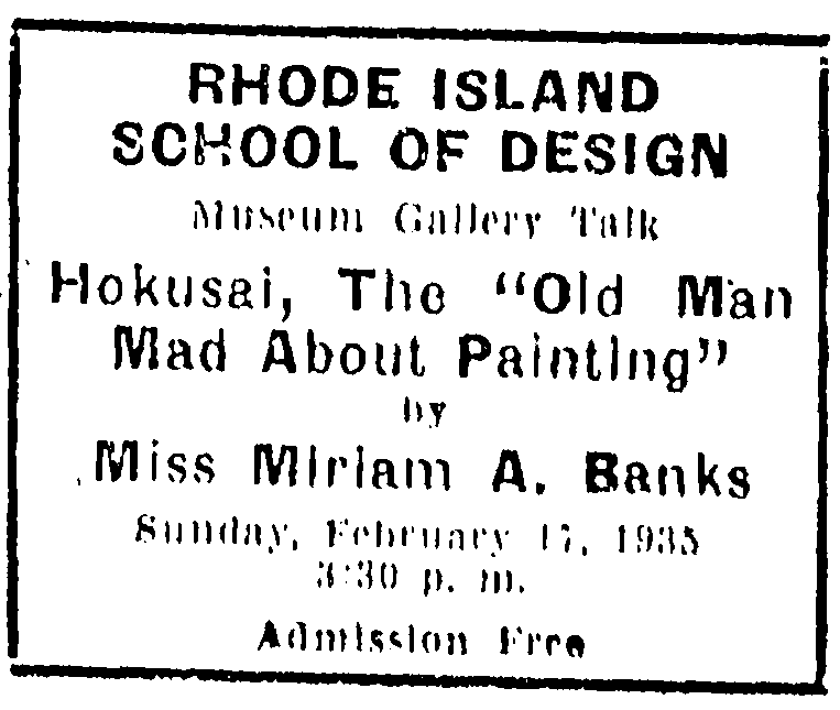
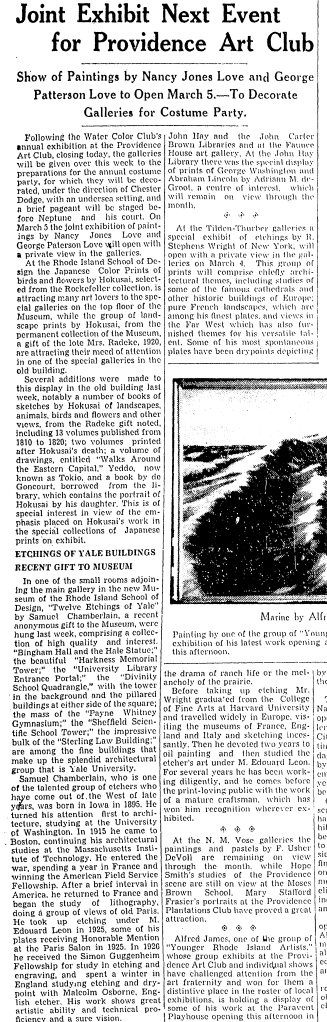
The RISD celebrated its recent acquisition with an exhibition of the works and a lectures, open to the public—which Lovecraft attended, as he often took advantage of the free lectures on art and science offered by the local universities.

Saw a fine exhibition of Hokusai’s prints—with explanatory lecture—at the museum yesterday.
—H. P. Lovecraft to F. Lee Baldwin, [13 Feb 1935], LFB 123

Saw a splendid exhibition of Hokusai’s prints—with explanatory lecture—at the museum yesterday.
—H. P. Lovecraft to J. Vernon Shea, [19 Feb 1935], LJS 254

Some darned good lectures & exhibitions at one of your two local almae matres—the School of Design. Last week they featured Hokusai—& last night there was an illustrated discourse on Soviet art (in Memorial Hall) which would have had Sonny Belknap jumping up & down & piping!
—H. P. Lovecraft to Wilfred B. Talman, [19 Feb 1935], LWT 253

Providence Journal 24 Feb 1935, p55

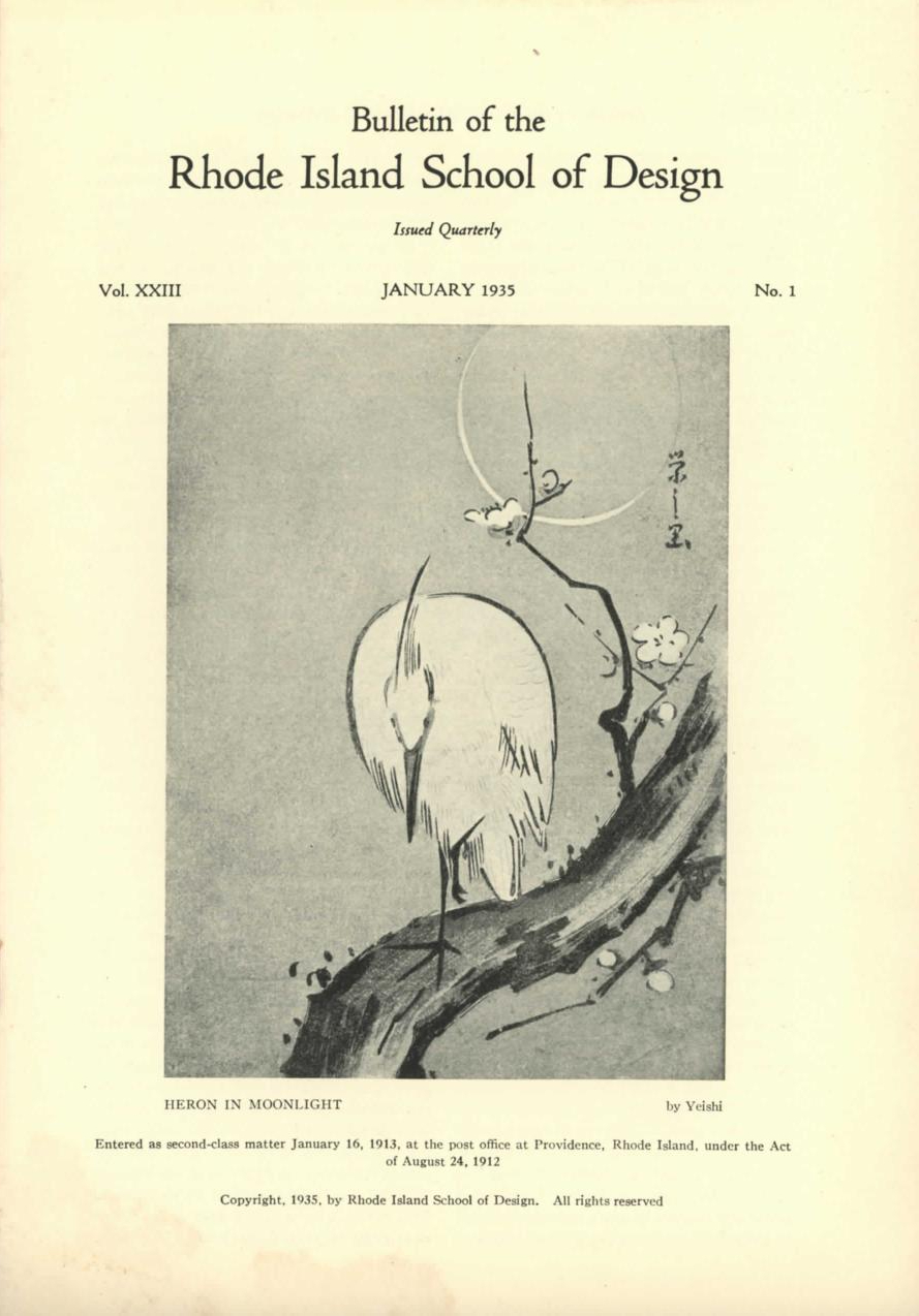
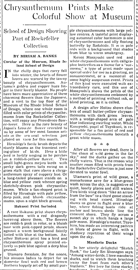
The Bulletin of the Rhode Island School of Design (Jan 1935) was entirely dedicated to the gift of the prints and their subsequent display, as well as providing some background on Japanese art. Lovecraft was so impressed that he couldn’t help but grab a few copies to send to friends.

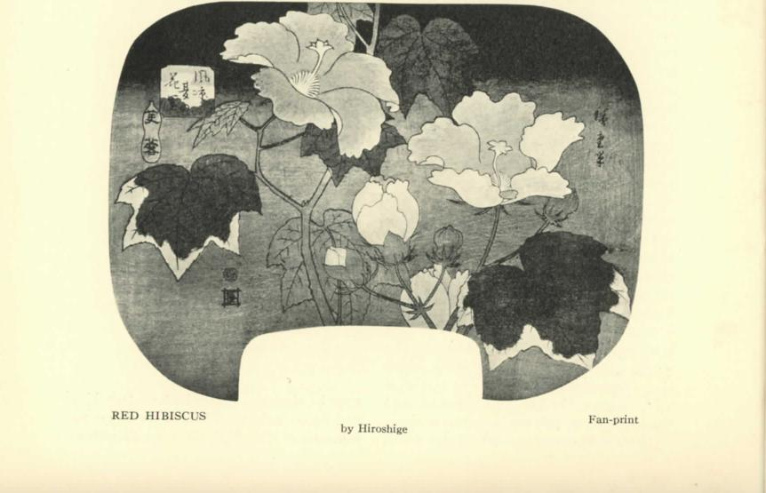
This month there was a splendid lecture & special exhibition pertaining to my favourite Hokusai, & the entire quarterly bulletin was devoted to the subject of Japanese prints. The article was so fine, & the illustrations so graphic, that I could not resist getting several extra copies to send to especially appreciative persons. Note one mistake—on p. 19, with illus. On p. 22—where a Hokusai fan print of hibiscus flowers is erroneously attributed to Hiroshige. I wouldn’t have spotted this if I had not seen the original prints & their authentic labels in the museum.
—H. P. Lovecraft to Elizabeth Toldridge, 27 Feb [1935], LET 298

Later in February I heard an excellent discourse on Hokusai in connexion with an exhibition of his prints at the local art museum. Japanese art certainly appeals to me as few other aesthetic forms succeed in doing. The current museum bulletin was devoted to this subject, & contains so fine an article—together with so many excellent reproductions—that I can’t resist sending you a duplicate under separate cover.
—H. P. Lovecraft to R. H. Barlow, [16 Mar 1935], OFF 221-222

Of lectures there may be noted a highly interesting address on Japanese prints in general & good old Hokusai (1760-1849) in particular, held at the local museum in connexion with an exhibition of the prints. Great stuff—I have always been exceedingly fond of the delicacy, tranquility, & exquisite harmony of Sino-Japanese art. Enclosed are some cuttings illustrative of this event—which ably supplements similar events of last December.
—H. P. Lovecraft to Helen V. Sully, 5 Mar 1935, LWT 404

While the clippings don’t survive, several relevant items in the Providence Journal from the period stand out as likely inclusions:

Lovecraft makes several other brief references to his trips to see the Hokusai prints to various correspondents throughout 1935:

More recently I heard a fine discourse on Hokusai (an old favourite of mine) at the art museum in connexion with an exhibition of his prints. Sino-Japanese art has always fascinated me extremely, & I wish I could afford a Japanese print collection of my own.
—H. P. Lovecraft to Richard F. Searight, 5 Mar 1935, LPS 360

Heard some good lectures recently—a reading by the poet Archibald MacLeish, a discourse on the Japanese artist Hokusai (1760-1849) in connexion with an exhibition of its prints at the art museum, & an account of contemporary Russian soviet art.
—H. P. Lovecraft to Duane W. Rimel, 10 Mar 1935, LFB 261-262

Regarding recent events—possibly I told you of the lecture on Hokusai in connexion with an exhibition of his prints. Great stuff—I’ve always been a devotee of Sino-Japanese art.
—H. P. Lovecraft to J. Vernon Shea, 13 Mar 1935, LJS 262

Heard some good recent lectures on Hokusai, contemporary Soviet art, & the mosaics of St. Sophia in Constantinople.
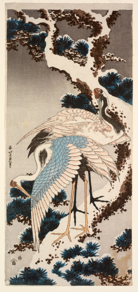
—H. P. Lovecraft to E. Hoffmann Price, 14 Mar 1935, LPS 173

I thought the Japanese print bulletin especially delightful–you may recall that Hokusai’s “Cranes on Snow-Laden Pine” was one of the things I especially liked in the exhibition last December. I was glad to get so good a reproduction of it. Another captivating print is the one of the cat watching the butterflies—which reminds me that the local feline family is now narrowed down to the mother & one coal-black kitten . . .  a delectable duplicate of the lamented Sam Perkins.
—H. P. Lovecraft to Elizabeth Toldridge, 25 Mar 1935, LET 300

I managed to get out to several lectures—poetry readings by Susanna Valentine Mitchell & the famed Archibald Macleish—author of “Conquistador”—& an excellent discourse on Hokusai at the local museum, in connexion with a notable exhibition of his prints. Japanese art certainly appeals to me as few other aesthetic forms succeed in doing.
—H. P. Lovecraft to Clark Ashton Smith, [26 Mar 1935], DS 598

The RISD exhibition seems to have inspired Lovecraft to seek out more of Hokusai’s work, when available. Later in 1935 when traveling in Philadelphia, he stopped in at the Philadelphia Museum of Art, which was also having an exhibition of Japanese prints:

I also visited the art museum, where an especially fine temporary exhibit of Japanese prints (including the entire Fujiyama, bridge, waterfall, & poem series of my favoruite Hokusai) was on display.
—H. P. Lovecraft to Helen V. Sully, 23 Sep 1935, LWT 438

Despite Lovecraft’s claims to have always appreciated Sino-Japanese art, the specific interest in the prints of Hokusai seems to have come very late in life, driven by the sudden availability of these materials at a local museum. Lovecraft lamented that he could never own a collection of such prints, and in truth there were relatively few published reprints available in the mid-1930s. Buying originals was a game for collectors, and museums were an invaluable resource for those who wished to experience art that they could never afford.

It is important when reading these brief appreciations to understand how thoroughly Lovecraft had absorbed the Orientalist ideas of his day. Racially, the Japanese were other, yet the stereotypes surrounding them were conflicting, covering both admiration for the exotic culture that seemed keenly tied to nature and their own distinct customs, and repulsion at the looming military threat they posed, and their adoption of Western ways. Lovecraft would remark:

After all, as much as the modernisation of Japan is destroying, it may be that the innate aestheticism of the Japanese mind will manage to salvage more from the past than the western world can.
— H. P. Lovecraft to Elizabeth Toldridge, [8 Jan 1930], LET 121

Japanese culture will be hybridised with westernism—more & more as Japanese conquest increases the nation’s contacts with the west. It is a pity, because Japanese aesthetic traditions are among the finest in existence.
—H. P. Lovecraft to Donald A. Wollheim, 9 Jul 1935, LRB 305

The fascination with Hokusai and Japanese prints was one facet of Lovecraft’s fascination with Japanese (and to an extent, Asian cultures) as a whole. It was not an exception to his prejudice, but another aspect of a complex set of views that reflected both the deep cultural fascination with Japan and the Yellow Peril racial fearmongering that informed some of his own fiction. Nor did it begin and end with Hokusai; there is plentiful evidence in Lovecraft’s letters of interest in Japanese art and culture before and after…including Japanese poetry.

Let me endorse the Mocratic recommendation to obtain a free subscription to Travel in Japan. I have done so, & am thoroughly enthusiastic over the charm of the publication—its illustrations of Japanese scenery & architecture, its sidelights on Japanese art & design, & its glimpses of Japanese thought & feeling—musical, poetic bits like the extract cited. Mr. Moe has certainly not overrated the charm of this material—& I am led to wonder whether some English or American translator has prepared the visible text of the various articles & poems from originals in Japanese. In the Spring 1936 issue there is an article on the Japanese spring which well matches the earlier autumnal article. In it is quoted a very fine & typical hokku by the poet Saigyo Hoshi—

“Oh, would that I could
Split myself into many,
And, missing not a twig,
See all the glory of the flowers
In all the unnumbered hills.”

—H. P. Lovecraft to the Coryciani, 14 Jul 1936, ML 340

So when we read about Lovecraft and Hokusai, we are reading one thread of a continuing and complex interaction. Lovecraft was not quite a Japanophile, and his knowledge of Japan was imperfect and heavily influenced by the popular culture of his day, which presented views of Japan that were selective and not representative of the whole of Japanese culture. Yet these exposures to other cultures, however imperfect, did spark admiration and interest in Lovecraft—and readers today can see what Lovecraft saw, and perhaps will likewise come away with an appreciation for these Japanese artists and their work.

Rockefeller’s donated Japanese prints are still held by the Rhode Island School of Design, and many of them can be viewed for free online.

Lovecraft & Erotic Japanese Prints

Readers familiar with Hokusai will probably note an absence in the above descriptions of Hokusai’s work: the lack of erotica. The Rockefeller collection consisted primarily of nature studies, animals, plants, etc.; as far as I have been able to determine, none of Hokusai’s erotic works—such as the infamous “Diver with Two Octopi” (蛸と海女), more popularly known as “The Dream of the Fisherman’s Wife”—were included. Very likely, Lovecraft had no idea about this phase of Hokusai’s career, and possibly had no idea of erotic Japanese prints whatsoever.

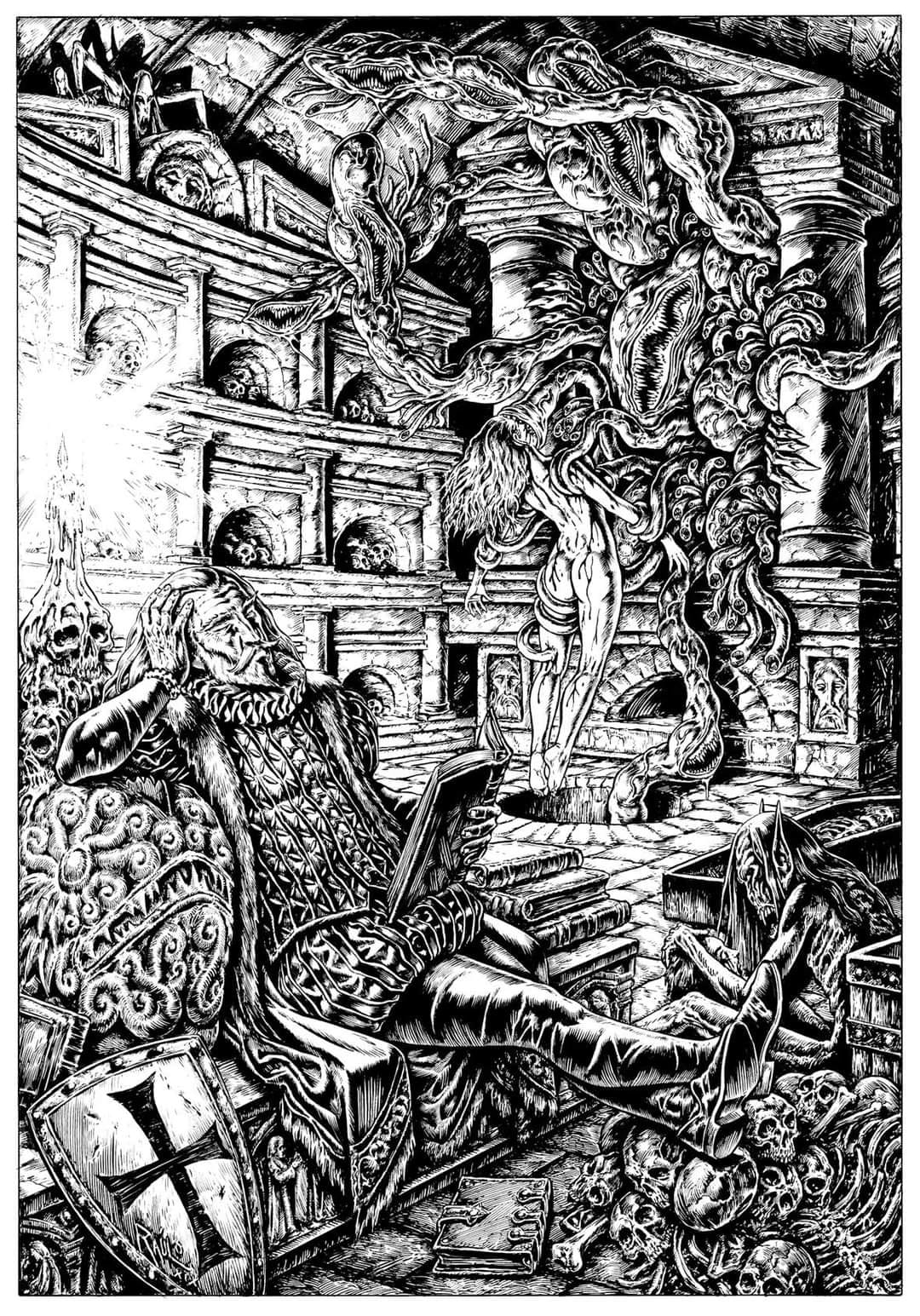
Which is not to say that Japanese tentacle erotica had no effect on Lovecraft, only that it likely had no direct effect. Japanese erotic prints (shunga) were popular and influential among European artists in the late 19th century, works like Erotic Japonisme by Ricard Bru and Secret Images: Picasso and the Japanese Erotic Print trace this influence, and in particular how the erotic tentacle motif became established in science fiction art through works like Henrique Alvim-Corrêa’s The Martian Claims a Victim (1906) from his illustrated edition of The War of the Worlds.

Among the many influenced by Japonisme and Japanese print artists such as Hokusai was Aubrey Beardsley, the famous illustrator of the Yellow Book magazine and the first edition of Arthur Machen’s The Great God Pan and The Inmost Light (1894). (For more on which, see Linda Gertner Zatlin’s Beardsley, Japonisme, and the Perversion of the Victorian Ideal (1997).) The image of the tentacle as an alien force spread through the decadent 1890s into the early weird fiction of M. R. James and Arthur Machen as well as the science fiction of H. G. Wells, and by the time of H. P. Lovecraft and his peers the pulp magazines were well-accustomed to this image, and used it in their own work—not generally to penetrate in a sexual manner (that would come later), but as a symbol and motif of corruption and degeneration.

This is the side of Hokusai that Lovecraft very likely never got to see and wasn’t even aware of. The way in which these ideas and images spread and change over time is fascinating and worthy of study.

Providence Journal, 3 Nov 1935, p70

Bobby Derie is the author of Weird Talers: Essays on Robert E. Howard and Others and Sex and the Cthulhu Mythos.

Deep Cuts in a Lovecraftian Vein uses Amazon Associate links. As an Amazon Associate I earn from qualifying purchases.

The Colour Out of Space (2016) by H. P. Lovecraft & Amy Borezo

In 2016, artist Amy Borezo published a very limited illustrated edition of H. P. Lovecraft’s story “The Colour Out of Space.” To quote from Shelter Bookworks’ original page:

This hybrid artist’s book/contemporary fine press edition of the 1927 horror/sci-fi story by HP Lovecraft includes an introduction by Lovecraft scholar S.T. Joshi and 14 color images by Amy Borezo. The artist lives near the supposed site of this fictional tale and frequently walks the old roads of the towns written about in this story. In creating the imagery for this work, the artist is interested in evoking the complexity of the local landscape in abstract form with the construction of the reservoir overlaid visually through geometric blocks.

The text for this edition was provided by S.T. Joshi from his recent publication, H. P. LOVECRAFT: COLLECTED FICTION: A VARIORUM EDITION [Hippocampus Press, 2015] and is derived from a typescript at Brown University, evidently prepared by F. Lee Baldwin for a proposed reprint of the story (c. 1934) that never happened. It has some revisions in pen by Lovecraft, so presumably it represents his final wishes for the story.
_____________________

Relief printing on Zerkall Book paper from photopolymer plates on a letterpress. Body text set in Caslon, titles in Futura. Pages sewn onto a shaped concertina. Paste paper over boards with a buffalo suede spine. Housed in a presentation box. Special thanks to Lisa Hersey who assisted in printing and binding.

The edition, despite the relatively high cost (US$500 + shipping in 2016), sold out. It arrived in an attractive clamshell box, with a paper label. Inside, the colors on the paper are bright and vivid in a way that the light and the camera don’t really catch, the backstrip soft, the paper creamy and the text sharp. In your hands, the brilliant orange seems to leak through around the edges of the pages. A title page, a brief introduction by S. T. Joshi. The text and illustrations are on alternate pages, distinct, the images vivid but abstract. A word on the artist, a colophon and numbering page, and then the book is at an end.

Amy Borezo’s illustrated edition is, in a very real sense, a piece of art that you can read. The text itself is meticulous in its accuracy, but you can read the same text in Hippocampus Press’ variorum edition, you can read the same text for free online. If you must have a physical copy of a book in your hand, you are spoiled for choice: “The Colour Out of Space” is one of Lovecraft’s most reprinted works, and there are innumerable illustrations for the story from various artists, from J. M. de Aragon in the pages of Amazing Stories in 1927 and Virgil Finlay in Famous Fantastic Mysteries in 1941 to many others of the current day.

This massive plurality of choice, the sheer number of editions, touches on an issue that many readers and would-be readers of Lovecraft deal with: where do you start? What is the best edition? What if you want a really nice copy of a book? Which one of all the hundreds of titles should you go for, and why, and how much will it cost?

If that sounds like more of a collector’s issue than a reader’s issue, then congratulations, you’ve hit on one of the fundamental problems facing not only Lovecraft, but most popular authors in the contemporary period.

When Lovecraft was alive, he was primarily published in the amateur press, pulp magazines, some reprint anthologies like the British Not at Night series, and a couple of very small privately printed editions of The Shunned House (never bound or formally released during his lifetime) and The Shadow over Innsmouth (which was, but the binding was shoddy). There were no finely bound editions of Lovecraft with the embellishments of the bookmaker’s art available to the general public, no leather covers, no gilt lettering, no raised bands (caveat: one copy of The Shunned House was specially bound by R. H. Barlow as a gift for Lovecraft).

Early collectors of Lovecraft often focused on posthumous publications, like the first publications of Arkham House, and little obscurities like the edition of Lovecraft’s commonplace book put out by the Futile Press in 1938. Even ultra-small press editions were typically not “fine” in the sense of lavish materials, artwork, or presentation, but were often considered valuable simply because of the small size of their edition, the ease with which copies perished, and subsequent rarity in the face of growing demand. That demand came from Lovecraft’s own growing popularity; the mass market paperback reprints of Arkham House collections, the armed services editions, and foreign reprints in hardback and paperback vastly increased the audience for Lovecraft’s work.

Until quite recently, fancy fine press editions were not normal for living authors. Before mass literacy, books were often bought unbound and then the author could bind them however they liked; really rich people could commission books that were themselves works of art in every sense of the word, involving whatever costly materials or decorations they cared for. As the commercial basis of book reading and publishing became more egalitarian, fancy editions often became more about the skill of the bookmaker and/or any associated artist, for fine press editions, and the materials shifted.

So when you look at what constituted a really nice Lovecraft edition in, say 1980, you’re likely looking at the output of Roy A. Squires’ press. These were meticulously crafted letterpress editions, usually on high-quality handmaid paper, sometimes featuring tipped-in photographs or other illustrations. Where a normal chapbook from Necronomicon Press or a fan press might be published on an Apple II printer and stapled together, everything about Squires’ production was done by hand.

The slightly bourgeoisie desire for something fancier still nagged the science fiction and fantasy market. Arkham House paved the way in the late 1930s and 40s by showing that a small press publisher specializing in genre books was viable (the presses they inspired apparently didn’t know how often Arkham House founder August Derleth was running in the red, or how long it took for his small, relatively expensive books to sell). Most of these products weren’t fine press; they were solid books, aimed and priced at a select market. Very few of them produced anything that might be described as a luxury edition of Lovecraft; the choicest example might be the 1976 edition of Démons et Merveilles by French publisher Opta, which came bound in leather, with slipcase, and illustrations by Philippe Druillet. The translation has its issues (Lovecraft’s “ghouls” is rendered as “vampires,” to give one notable example), but compared to the rather plain but sturdy Arkham House editions, it’s gorgeous.

Easton Press (founded in 1975 as a division of MBI, Inc.) took up the gauntlet of producing, for lack of a better term, what not-rich people think of as rich people’s books: bound in letter, embossed in 22k gilt, very snazzy to look at. In practice, while Easton Press has consumed many acres of cowhide, the actual books they produce tend not to be very special: they’re reprints of existing books, often not anything particularly rare or obscure, with no additional editorial guidance or notes (and sometimes bad misprints). The books themselves are usually solid, but less than beautiful; their editions of Lovecraft show evidence of corner-cutting and mass production.

There is a niche market for really nice editions of books, at a price affordable to middle-class bibliophiles. Over the last twenty years or so, that niche market has exploded. Centipede Press, Subterranean Press, the Folio Society, etc. are names that are familiar now for deluxe editions of Lovecraft and/or other authors, typically reprinting older works instead of presenting anything original, and typically publishing in limited editions of a few hundred copies. Quality and presentation vary, although are generally pretty high—not quite the same production value as, for example, letterpress outfits like Pegana Press which continue the fine press tradition, but for high-end versions of books that you might otherwise buy at Barnes & Nobles…

…and that is kind of the rub. While there are some exceptions, most of these presses aren’t gambling on producing anything new. There might be new artwork, there might be a new introduction by Alan Moore or S. T. Joshi, but there is no experimentation, there is often nothing unique about these particular editions. There are some exceptions; Centipede Press has produced some original compilations like Conversations with the Weird Tales Circle that collects many rare, obscure, and out-of-print materials; and the art book A Lovecraft Retrospective is pretty much unparalleled. Helios House Press has published some original scholarship among the reprints (full disclosure: they’ve paid me for a few essays and other work).

For most of these companies, however, the text itself isn’t special. The production quality might not be much better than any other mass-produced hardcover. They might be pretty, but from a strictly objective standpoint they don’t offer much new or exciting. They’re just very expensive.

So what exactly are you, the reader, paying for?

Which is what you need to answer for yourself. If you’re a scholar or academic looking for a text that’s pure Lovecraft, you’re probably better off buying the Hippocampus Press variorum editions. If you’re a casual reader, the Penguin paperbacks are cheap and almost as good. If you’re a poor student, stick to the online editions at https://hplovecraft.com. If you want a fancy edition…well, you’ve got options. Lots of them, for every price point. Handmade Japanese paper, bound in leather, with silk bookmarks, signed in blood.

It’s all available for the right price.

So what sets Amy Borezo’s book apart? Normally, based on the materials, the quality of the printing and craftsmanship, I would qualify this as a fine press product. However, in the marketing, the presentation, this is a little different. It is a book, and can be read as a book, but it is also a work of art, and can be experienced and appreciated like buying a lithograph print from a series. If you’re a fan of Lovecraft, you know the words, you’ve read the story a hundred times. Many artists have tried to capture a colour that lies beyond human perception, to depict the events of the story in some fixed form. Only Borezo has gone to such effort to capture that feel in an entire book production, not just as isolated images.

The beauty of Borezo’s art is that it is abstract; it doesn’t try to impose meaning on the text, readers have to stare at it for themselves. Some might not like it, others might get it but not care for the idea, but for me there’s a certain tactile experience with that nearly radioactive orange that seems to seap through and around the pages at times. Yes, it could just be the collector in me, trying to justify the hundreds of dollars this book cost, but in a real way that is the experience we buy with every book, above and beyond the text itself. The feel of it in your hands, the smell of the paper, the crackle of the spine. It’s different, when you’re holding an old pulp whose brittle and yellowed pages are as fragile as a papyrus from a mummy’s tomb, or an old worn paperback whose tanned pages are as soft as toilet paper, or a crisply printed new edition with ink that almost looks still wet.

From a scholar’s perspective, from a historian’s perspective, the focus is usually on the text, not necessarily the visceral experience surrounding how the text is read and received. Yet it is important not to lose touch with that. In an age where Lovecraft is in the public domain, generative AI, and print-on-demand publishing, we are going to see a vast proliferation of books—many of which are going to be strictly hypothetical until someone orders them—and our eyeballs will see cover art generated by some pseudointellectual property theft engine and with text scraped off of somewhere online (errors and all), and pre-packaged to try and appeal to someone that wants to read Lovecraft—and whatever the end product is, the one thing I can guarantee is that it is not going to be anything like Amy Borezo’s edition of The Colour Out of Space.


Bobby Derie is the author of Weird Talers: Essays on Robert E. Howard and Others and Sex and the Cthulhu Mythos.

Deep Cuts in a Lovecraftian Vein uses Amazon Associate links. As an Amazon Associate I earn from qualifying purchases.

“Candlewax” (1990) by W. H. Pugmire & Ashleigh Talbot

Eldritch Fappenings
This review deals in part with artwork that includes nudity and/or sexuality explicit content.
As such, please be advised before reading further.


In the 1985 Christmas supplement to the fanzine Fungi, W. H. Pugmire‘s story “Candlewax” first saw publication. This was one of Pugmire’s earliest efforts at Mythos fiction, and is a part of his Sesqua Valley cycle—his own corner of Lovecraft country set in the Pacific Northwest, populated by characters like Simon Gregory Williams. While Pugmire would go on to write many more tales of Sesqua Valley, which have been collected and published in various volumes, “Candlewax” is one of the comparatively rarer tales, having been reprinted only a handful of times—and, most interestingly, in an illustrated edition.

Discrete Ephemera (1990) is a limited edition (500 copies) book art project by Ashleigh Talbot, and illustrated texts by Steven J. Bernstein (“Face”) and W. H. Pugmire (“Candlewax,” as “W. F. Pugmire”), made possible by an art grant. Madame Talbot is presented throughout via a symbol:

The book exists in different states. My copy of 136 unnumbered sheets is bound between sheet metal plates with a small brass padlock, while others are bound in textured wallpaper; with a fingerprint imprint in gold ink (some listings say blood, but it looks like gold ink to me) on the limitation page, and a tipped-in photo of Pugmire in the nude. The overall aesthetic is strongly reminiscent of underground comix, punk zines, and copybooks of the 1960s-1980s, with an emphasis on cut-and-paste techniques, surreal imagery, the presentation of familiar images in unfamiliar contexts or subtly distorted, and a Burroughs-esque eye for the unfiltered and sometimes teratophiliac reality presented by medical textbooks and cabinets of curiosity.

Example of the wallpaper cover from the Mullen Books listing.

The illustrated version of Pugmire’s “Candlewax” is distinct from the rest of the project, but mostly because it has a coherent, linear narrative, with a darker, more Gothic tone than the more stylized kaleidoscope of images that preceeded this section, or the much more comic-strip style collaboration “Faces” with Bernstein. While Talbot continues to use the same distinctive style, the illustrations work to complement the text, at times a strict depiction, and at times more abstract and evocative.

The story itself is a sketch in miniature of bibliomania, murder, necromancy, hubris, and revenge. A fitting snapshot of the kind of obsession that has characterized aspects of the Mythos (and readers of the Mythos) from the beginning.

At least two versions of the “Candlewax” text have seen print. Pugmire had a tendency to rewrite his stories when they were reprinted, and this seems to be the case here as well. To give the flavor of the difference:

The man was a dwarf. His bent and twisted frame, disfigured by age and nameless ailments, seemed perpetually trembling. Drool moistened thin black lips, and yellow pus oozed from reddened eyes. A skeletal finger tapped the book that lay before him, and he addressed his visitor in a whispered voice.

“His name was Simon Gregory Williams. He wrote this book of spells in the late 1960s. That in itself makes it unique. Most of my books are ancient tomes, crumbling and worm-infected. But, as you see, this looks almost new.”
The tiny man bent his twisted frame toward the curious tome. Drool moistened his thin grey lips; yellow pus oozed from his reddened eyes. A skeletal finger tapped the yellow cover of the book. He addressed his visitor in a low whispered voice.

“His name was Simon Gregory Williams. He wrote this book of spells thirty years ago, while visiting the poet William Davis Manly, in your curious Sesqua Valley.” Here he opened the book and turned to various illustrated pages. He stopped at a vivid depiction of a tremendous mountain of white stone, the twin peaks of which resembled wings folded up on a daemon’s shoulders. “The infamous Mount Selta, of which I’ve heard so much. And below, in purple ink, the name ‘Khroyd’Hon’; such a strange name.”
“Candlewax” in Discrete Ephemera (1990)“Candlewax” in Mythos Tales & Others #1

The 1996 text deals much more with the Sesqua Valley cycle, probably to better incorporate it into the loose collection of stories and the Mythos that Pugmire would continue to build on in tales like “An Imp of Aether” (1997). Readers hunting this particular text may find themselves like the protagonist Oscar James, hunters of arcane lore about that mysterious vale and its even more mysterious occupants.

Left: Sesqua Rising, right: Discrete Ephemera

With an edition of only 500 copies, Discrete Ephemera and its illustrated version of “Candlewax” is very scarce and relatively expensive. Graeme Phillips reprinted the entire illustrated story in the chapbook Sesqua Rising (2016), but that was limited to only 50 copies, and is even scarcer, making this one of the rarest of Pugmire’s collaborations.

Madame Talbot also collaborated with Pugmire on some illustrated prose poems, and wrote:

I was thrill’d when one of my early Mythos stories, “Candlewax”, appear’d fully illustrated in one of Ashleigh’s hand-made books. There is nothing more thrilling than working on projects with outstanding artists 

W. H. Pugmire, “In Collaboration with Genius” (2016)

What is Discrete Ephemera and “Candlewax”? A collaboration of talents, a cross-pollination of ideas, attitudes, and styles. Discrete Ephemera is a kind of punkish grimoire, an art object to be experienced more than a text to be read and consumed, and in that sense “Candlewax” almost feels like a metatext…or, perhaps, a warning. For now, this copy is in my library. In time, it will be passed on to someone else. Hopefully, someone who gets it.


Bobby Derie is the author of Weird Talers: Essays on Robert E. Howard and Others and Sex and the Cthulhu Mythos.

Deep Cuts in a Lovecraftian Vein uses Amazon Associate links. As an Amazon Associate I earn from qualifying purchases.

“Shambleau” (1955) by C. L. Moore & Jean-Claude Forest

In 1933, C. L. Moore burst into the pages of Weird Tales with “Shambleau,” to immediate acclaim. The story was reprinted a couple of times over the ensuing decades, and formed the headline of Shambleau and Others (1953, Gnome Press), Moore’s first hardcover collection of her early Weird Tales fiction. The first foreign translation was in France in 1954, when it was translated for the anthology Escales dans l’infini (“Stopovers in Infinity”), translated by editor Georges H. Gallet.

The next year, Gallet’s translation was reprinted in V Sélections Été (Summer) 1955 issue.

V began publication as a weekly magazine in France in 1944 and went through several different names and editorial regimes, including V, V magazineVoir magazineVoirMLN illustrated magazine, and L’Hebdomadaire du reportage. V also spun-off several sister-titles, including V Cocktail, V Sélections, and V Spécial. All of the magazines in the V family seem to have shared the prominent feature of the female form, usually as a pin-up on the cover and as black-and-white photographs, illustrations, and cartoons throughout. G. H. Gallet was the editor-in-chief of the magazines.

The overall tone and audience is often hard to judge at this remove, like American men’s magazines of about a decade later, they appear to be a mix of general interest articles, fiction, slightly racy featurettes with nudes, and the kind of mildly risque cartoons that seem a bit innocent today. These were not, by any stretch of the imagination, pornography: each issue featured tasteful nudes, pin-ups, and bawdy jokes intermixed with a great deal of other articles, interviews, and features…and they had an eye for talent, sometimes featuring artists who would go on to a bit of fame and notoriety.

Jean-Claude Forest was born in 1930, and began working as an illustrator in the early 1950s. Like Gallet, Forest had a deep love of science fiction, and would become a renowned cover artist for the French sci-fi paperback series Le Rayon Fantastique, and achieve international fame for his sexy sci-fi epic Barbarella, created for V in 1962—his list of works, achievements, projects, and accolades is too long to go into here. Yet before Barbarella, he illustrated “Shambleau.”

Forest’s illustrations are a classic example of raygun gothic sensibility, and the same clear, sparse line work, framing, and figure-work will be familiar to fans of his comic strips. Yet he also took the opportunity to emphasize the sensuality and horror that is Shambleau, the scattered layout adds a certain dynamism to the blocks of justified text—and when Shambleau stands revealed, the text almost seems to give way before the tentacle-writhed woman who stands bold and stark on the page, eyes shadowed, rough as a crayon-sketch in places.

Forest seems to have taken relatively little inspiration from previous illustrations in Weird Tales—may not even have seen them—but appears to have at least been aware of the 1953 Gnome Press cover. Compare, for example, the characteristic shape of the “S” in the title at the opening of the story, and the “S” on the cover of the 1953 Gnome Press collection by Ric Binkley:

There is a certain irony to the fact that while non-English-reading audiences sometimes have to wait longer to get classic works of English-language weird fiction (and vice versa), sometimes when those works are finally made available, they are graced with the creative energies of more skilled artists and dedicated designers and editors. The original audience rarely gets a chance to appreciate this kind of art, since it is rarely translated back into English-language products.

Fortunately, in 2023, the original art by Forest was combined with Moore’s English-language text and an introduction by Jean-Marc Lofficier, and published by Hexagon Comics and Black Coat Press as The Illustrated Shambleau. While this lacks the dynamic swatches of grey and the distinct layout of the original, English-language readers who want to appreciate Forest’s art and Moore’s prose together can finally do so.

Better scans of the original pages can be seen at Cool French Comics, and those curious about the full magazine that “Shambleau” first appeared in can download it from here.


Bobby Derie is the author of Weird Talers: Essays on Robert E. Howard and Others and Sex and the Cthulhu Mythos.

Deep Cuts in a Lovecraftian Vein uses Amazon Associate links. As an Amazon Associate I earn from qualifying purchases.

Deeper Cut: Lovecraftian Movie Posters From Ghana

The first regular movie screenings in Gold Coast colony took place in Accra shortly after 1900 when traveling showmen from other parts of West Africa began screening their wares in various coastal cities on tours that took place over a period of months. The Gold Coast’s first purpose-built movie theatre, constructed by the British businessman John Bartholomew on Station Road in Accra, dates from 1914, just seven years after the first purpose-built theatre appeared in the United Kingdom, illustrating the very rapid spread of cinema technology and film entertainment across the empire although the logistical and financial challenges of operating in a colonial location limited further expansion at that time.

Gareth McFeely, “Gone Are The Days”: a social and business history of cinema-going in Gold Coast/Ghana, 1910-1982 (2015) 138

The British Empire claimed the Gold Coast in Western Africa as a colony from 1821-1957, and for many years it was white British businessmen who dominated the modest cinema industry and controlled what kinds of films were shown and when—and sometimes to whom, as Batholomew’s theater sometimes staged “Europeans Only” showings (McFeely 142). The modest little industry expanded slowly through the period of silent films and into the era of sound, marketing primarily English-language British and American films to an increasingly English-speaking and English-literate audience. Films were subject to the approval of the Cinematograph Exhibition Censorship Board of Control and other British laws and regulations.

Even as neighborhood theaters continued to expand to meet the needs of a growing urban population, beginning in the 1940s, the colonial government’s Gold Coast Film Unit also used buses to distribute documentary films, newsreels, and government information films to rural areas, including propaganda films produced by the Colonial Film Unit. In 1957, Ghana achieved independence and operated as a commonwealth realm; the new government took over the colonial-era government’s production and showing of films, and this continued when Ghana became a republic in 1960, with the government-owned Ghana Film Industry Corporation established in 1964 and the state-owned West African Pictures Co. Ltd., which ran a chain of movie theaters. Foreign entities like AMPECA (American Motion Picture Export Company) had to deal not just with government regulations and censorship, but sometimes direct competition with private theater owners in Ghana.

Political unrest and economic hardship rocked Ghana for much of the later 20th century, notably the military coups of 1966, 1972, 1979, and 1981; the government finally transitioned back to civilian democratic rule in 1993. During this period of turmoil, film censorship in the country slackened:

Films such as Blacula and The Exorcist underline the mild nature of censorship in the mid 1970s: a decade earlier the censor banned almost all horror films, never mind ones that contained dramatic scenes of bodies rising from the dead or adolescent girls possessed by evil spirits.

Gareth McFeely, “Gone Are The Days”: a social and business history of cinema-going in Gold Coast/Ghana, 1910-1982 (2015) 311

Economic hardship still continued, with inflation, widespread unemployment, and sometimes radical shifts in government policies all making it more costly to import films and keep up ticket receipts. Worse, after the 1981 coup the government enacted a nighttime curfew that lasted for two years, effectively destroying the old business model of nighttime cinema screenings.

In the early 1980s, the first independent films were produced in Ghana, many taking advantage of the Video Home System (VHS) technology to film direct-to-video. Videocassette recorders (VCRs) first became commercially available in the mid-1950s, but it wasn’t until the 1970s that home systems became commercially viable, with VHS emerging as the dominant format. The increasing availability and lowering costs of VHS VCRs spurred the home video market; films that were previously only available in traditional movie theaters could now be rented or purchased to view at home for relatively little cost, and the smaller, more portable, and cheaper VHS cameras lowered costs for independent filmmakers. Video rental stores proliferated in countries like the United States of America and the United Kingdom, and some filmmakers and distributors increasingly skipped traditional theater releases, releasing their films directly to video.

In many ways, the VCR changed how people all over the world watched and interacted with movies. Video cassettes were now marketed directly to the public, with the art on the paper sleeve taking the place of the traditional cinema poster. The lowering cost and increasing availability of video cassette technology allowed it to penetrate new global markets. You no longer needed to build a special building just to show films, and entrepreneurs were no longer restricted to government-made entertainment or officially licensed imports. In the 1980s, as the first independent Ghanaian filmmakers were shooting direct-to-video, small VCR-based theaters and video clubs began to pop up in urban areas of Ghana like the capital Accra, often with pirated video tapes:

With the widespread introduction of foreign videocassettes into Ghana in the mid-1980s, a group of entrepreneurs created small-scale mobile film distribution empires, sending their agents out on the road with videocassettes, television monitors, VCRs, portable gas-powered generators and rolled-up canvas movie posters. This mobile cinema phenomenon quickly became a part of the cultural domain of even the smallest villages and hamlets in the Ghanaian countryside. In the early years a big city distributor or his aide would roll into town—often by bus—possibly for three or four days, and begin the local version of a movie marathon. By day this would generally occur within the confines of a family home or possibly some small communal meeting center, such as a social club; by night, weather permitting, in the open air. By the early 1990s, these mobile cinema operations had peaked and local businessmen at the village level had largely replaced their traveling predecessors, purchasing their own TV sets, generators and VCRs. In order to assist with marketing, the big city distributors continued to provide a hand-painted-on-canvas movie poster with each cassette they rented or sold.

Ernie Wolfe III, “Adventures in African Cinema, 1975-1998” in Extreme Canvas (2000) 25-26

The timeline for when exactly hand-painted posters emerged in Ghana is unclear; through the 1970s Ghanaian theaters would use standard industry posters:

The main methods of advertising to this varied clientele were posters outside the theatres and the projection of trailers for coming attractions. Until the 1970s, American and British film distribution companies supplied posters and other advertising materials at the same time as the reels of film, while locally hand-painted canvas posters, similar to the vivid panels used to publicize concert party performance, were also used at times.

Gareth McFeely, “Gone Are The Days”: a social and business history of cinema-going in Gold Coast/Ghana, 1910-1982 (2015) 166

Using pirated VHS tapes would mean no official marketing materials, however; to advertise these films, local Ghanaian artists were commissioned to hand paint posters, often on cheaply available materials like flour sacks (and later, locally milled linen canvases, Wolfe 26). These were typically local commercial artists—sign painters and the like—who watched the film or used existing video cassette box art for inspiration. Many of these were foreign films, produced in Hong Kong, India, Nigeria, and the United States; as a consequence, the artistic sensibilities and commercial priorities for these handmade signs were very different from Hollywood or Bollywood counterparts. Few actor names appear, and the posters may feature nudity, graphic violence, gore, and spoilers that didn’t appear in the original advertising materials.

By the late 1990s cheap preprinted publicity materials had crowded local advertising traditions out, while the video club boom had also peaked, reducing the demand for eye-catching advertising materials in a market where profit margins were razor-thin.

Gareth McFeely, “Gone Are The Days”: a social and business history of cinema-going in Gold Coast/Ghana, 1910-1982 (2015) 166

Pure economics ultimately brought about the demise of this once-thriving and extremely localized contemporary African painting phenomenon. By 1996, with the Ghanaian economic boom of the late 1980s and early 1990s nearing its end, mobile cinemas were all but gone and video clubs had reached their peak. Business interests outside of Ghana, often from Europe, had begun providing many more video titles to the local marketplace, and with them for the first time came a large inventory of free offset-printed posters.

Ernie Wolfe III, “Adventures in African Cinema, 1975-1998” in Extreme Canvas (2000) 26, 28

By the 2000s, the hand-painted movie poster tradition was in serious decline; the spread of television in Ghana, the advent of digital video discs, and mobile video streaming increasingly made home viewing more accessible and affordable to local audiences. The Ghanaian movie posters began to receive international recognition with the publication of works like Extreme Canvas (2000) and art gallery exhibitions. As local demand declined, the market for such art shifted. Original posters became collectibles to be displayed in art galleries and sold on eBay; new posters might be commissioned and prints sold through marketers like the Deadly Prey Gallery for a Western audience who appreciated the aesthetic, or produced for exhibitions of contemporary African art—but the original theaters and context in which these artworks first emerged is essentially gone.

Of all the films to receive the Ghanaian treatment, very few are examples of Lovecraftian cinema. While potentially any video cassette could make its way to Ghana, there were a few practical limitations when considering such works that have come to light: the film had to be released on video cassette between c. 1985-1999, a relatively available mainstream or direct-to-video release, and would need to be sufficiently lurid or gory to appeal to Ghanaian audiences—or at least, to produce a poster sufficiently striking or memorable to be subsequently noticed and reproduced for Western audiences. By no means has every handpainted movie poster from Ghana been preserved; these posters are the quintessence of ephemeral commercial art, aging quickly and destined to be eventually discarded once their purpose was served.

In practice, this rules out the early Lovecraftian films of the 1960s like The Haunted Palace (1963), Die, Monster, Die! (1965), or The Curse of the Crimson Altar (1968), and more obscure or international independent efforts like Cthulhu Mansion (1990) or Cthulhu (2000), leaving a handful of adaptations and more loosely Lovecraftian films.

The Dunwich Horror (1970)

A loose update and adaptation of Lovecraft’s “The Dunwich Horror,” set in the contemporary late 1960s. While there are few gory scenes in the film, the psychedelic visuals, Rosemary’s Baby-esque plot, and a brief scene of Wilbur Whateley’s twin brother might all appeal to horror aficionados in Ghana.

Official poster for The Dunwich Horror for reference.
Source: private collection

These posters all follow the official marketing for The Dunwich Horror (1970) fairly closely, and given when the film was released—before the “Golden Age” of hand-painted posters, when official posters were in circulation—some of the earlier artists may well have seen versions of that poster and consciously modeled their images on that. It’s notable that the poster signed A. Michael Art, which is probably the most recent, differs much more markedly in the design (even depicting actress Sandra Dee as Black!), and with several uncharacteristic elements not in the film (the grasping hands, the rope around her neck). What’s really striking is how all of the artists chose to depict the tentacles as snake-like hair, turning Wilbur Whateley’s twin into a gorgon-like figure.

Re-Animator (1985), Bride of Re-Animator (1990), and Beyond Re-Animator (2003)

The first Lovecraftian film by director Stuart Gordon and producer Brian Yuzna was an update and adaptation of “Herbert West–Reanimator,” followed by sequels Bride of Re-Animator and Beyond Re-Animator. Unlike the rather sedate Lovecraft adaptations of the 60s, this was a horror comedy with outstanding practical gore effects, black humor, vivid action, and intense visuals. It is little surprise that it attracted the attention of Ghanaian audiences.

Official Spanish Re-Animator poster for reference.
Source: Tribalgh Ethnic Art Gallery
Source: X.com
Original Japanese Re-Animator poster for reference.
Source: X.com
Source: Extreme Canvas 2 228
Source: Deadly Prey Galley on Facebook

The gore and nudity in Re-Animator, Bride of Re-Animator (labeled as Re-Animator 2 above), and Beyond Re-Animator gave Ghanaian artists plenty of opportunity to use their own imaginations, with the decapitation of Dr. Carl Hill (David Gale) given the spotlight. Two of the posters closely follow international marketing materials, albeit with their own Ghanaian spin (the reanimating reagent is replaced with blood in the first poster featuring Jeffrey Combs as Dr. Herbert West, and Barbara Crampton appears to have gotten a breast augmentation and is no longer censored by the blood drop in the lovingly rendered head-giving-head scene). While not explicitly labeled as Beyond Re-Animator, the final poster is easy to identify as that film because of the distinct depiction of the scene where a rat fights a reanimated penis (although in the film, the testicles are not attached).

Very noticeable about these posters is the skill and attention given to the lettering; while some of the artists may have closely copied other posters or appear to have been told the plot of the movie instead of watching it, the lettering on the titles is terrific.

Source: Extreme Canvas 2 226

As a related piece of work, consider this poster for Dr. Giggles (1992). Jeffrey Combs doesn’t appear in this movie—the eponymous doctor was played by Larry Drake—but Dr. Herbert West obviously resonated with at least one Ghanaian artist.

From Beyond (1986)

The second Lovecraftian film by director Stuart Gordon and producer Brian Yuzna is an update and adaptation of Lovecraft’s “From Beyond.” This film doubles down on suggestions of sex and the visual effects, with inhuman monsters and grotesque transformations. Fewer posters of this work have been preserved.

Source: Extreme Canvas 191
Source: Deadly Prey Gallery

The first poster for From Beyond is a not-entirely-inaccurate rendition of Dr. Pretorius (Ted Sorel) in his makeup; although the enlarged, external pineal gland has been rendered as a snake (shades of The Dunwich Horror posters). By contrast, the second post is completely unrecognizable as any imagery from the film, and indicates that the artist probably painted it based on a description or straight from the imagination.

Evil Dead II (1987) & Army of Darkness (1992)

Director Sam Raimi’s Evil Dead II and its sequel Army of Darkness defined the look of the Necronomicon for moviegoing audiences for a generation, and the image of the book as roughly bound in human skin with an actual face visible on the cover continues to influence depictions of Lovecraft’s fictional tome today. Ghanaian artists seem less interested in depicting the Necronomicon ex Mortis, however, than they were with the character of Ash (played by Bruce Campbell) with his iconic chainsaw-prosthetic.

Source: Extreme Canvas 185
Source: Extreme Canvas 186-187
Source: Tribalgh Ethnic Art Gallery

Between the two Sam Raimi films, there are a lot of great images and scenes for Ghanaian artists. Which is why it is surprising that the artists sometimes recombine the Evil Dead imagery with that drawn from other films, such as Amando de Ossorio’s Blind Dead series, John Carpenter’s The Thing, and what might be Pumpkinhead. Which might be false advertising, but the important thing was to get butts in seats, and the more exotic imagery of some of the posters shows how syncrenistic these posters could be, borrowing horrific images from other films to fill in the space and spice up the post.

Hellboy (2004)

This adaptation of Mike Mignola’s comic book character to the silver screen by director Guillermo del Toro falls outside the “Golden Age” of Ghanaian movie posters, and posters for it may have been produced later for Western audiences. The final Lovecraftian villain for the film gets less attention than Hellboy (Ron Perlman) and Karl Ruprecht Kroenen (Ladislav Beran).

Source: Mollusc No.6
Source: Ghanavision

It’s interesting to note that the first two posters both mention Ron Perlman by name, which was rare during the Golden Age unless the lead was an international superstar like Arnold Schwarzenegger. Bizarrely, David Hyde Pierce is also mentioned; Pierce had provided the voice for Abe Sapien (played by Doug Jones), but went uncredited in the film.

Some readers might be disappointed that these hand-painted Ghanaian posters aren’t more “Lovecraftian” in the sense of emphasizing imagery familiar to Western audiences—there are scarcely any tentacles, nary a Necronomicon, no signs pointing to Dunwich or Arkham or Miskatonic University—but that is part of the point and the charm of these posters. They were being created outside the wider Western cultural milieu; they were at several removes from the original fiction H. P. Lovecraft wrote, and were working within their own cultural context, with images that stood out to them or made sense for their purpose.

This is Lovecraftian cinema as Ghanaians would have seen it in the 80s, 90s, and 00s. When school kids might wait for the sun to go down, praying it wouldn’t rain, and then crowding into an open-air theater, like a drive-in without cars, all eyes glued on the screen. There were people in Ghana that could chant “Klaatu barada nikto!” as loudly as anyone else anywhere else in the world, who would hold their breath as David Gale’s disembodied head was lowered between the nubile legs of Barbara Crampton, or cringe as Ken Forey was eaten alive by things just beyond the edge of perception. It was their part of a shared experience, and these posters are the remnants of that, as surely as any Mythos tome ever stood as a record and monument of a lost age.

Suggested Further Reading:


Bobby Derie is the author of Weird Talers: Essays on Robert E. Howard and Others and Sex and the Cthulhu Mythos.

Deep Cuts in a Lovecraftian Vein uses Amazon Associate links. As an Amazon Associate I earn from qualifying purchases.

Insania Tenebris (2020) by Raúlo Cáceres

This dossier collects research on the nineteenth-century engravings of a mysterious Goya student that represent impossible beings and disturbing anachronisms.

Following in the footsteps of the Genius of Providence and inspired by the Cthulhu Mythos, the group of writers The Bastards of Abdul Alhazred and the cartoonist Raúlo Cáceres come together to recreate this universe of madness and darkness.
—Back cover copy, Insania Tenebris, translated from the Spanish

Spanish artist Raúlo Cáceres is no stranger to Lovecraft, and though many fans might not recognize him by name, there’s no mistaking his incredibly detailed, explicit style that often takes horror and eroticism for its subject. His comics and graphic novels in this vein include Elizabeth Bathory, Cuentos Mórbidos, Justine y Juliette (after the Marquis de Sade novels), and Agues Calientes, which have been translated into several languages. Less pornographic but still fun are books like Galeria de los Engendros Album de Cromos de los Monstruos, an album of monsters in the vein of 1970s and 80s compilations for kids.

For English-speaking audiences, Cáceres’ most notable work would include his work on Crossed, Crécy, and The Extinction Parade, but he also provided some gorgeous covers for Alan Moore and Jacen Burrow’s Providence which showcase not just his skill and style, but his deep appreciation for the details of Lovecraft’s Mythos.

providence-raulo-cover-02-finalwords

Cáceres was also the artist on the Lovecraftian horror series Code Pru, written by Garth Ennis, and Ennis/Cáceres continued the storyline in the anthology book Cinema Purgatorio, and provided illustrations for the Lovecraftian alien gods of Spanish roleplaying game Eden.

In 2020, Raúlo Cáceres published the first volume of Insania Tenebris: Textos de Los Bastards de Abdul Alhazered (Shadowy Madness: Texts from the Bastards of Abdul Alhazred), a 32-page collaborative project where multiple Spanish writers provided short text pieces to accompany Cáceres’ unique vision of Lovecraft’s Mythos—which takes the form of a series of found documents. Imagine stumbling across a dossier of evidence proving the existence of the Mythos, from ancient times through World War 2 and to the present day—illustrated in glorious and disturbing detail.

It is these collaborators who are the “Bastards of Alhazred”: Gabriel Soriano, Emilio Gómez, J. M. Morcillo, La doctora X, Gómez Navarro, Tito Alberto, and of course, Raúlo Cáceres himself.

InsTen3

En el lecho de un ataud asiste
sobre absorta dama, su piel mancilla
un lúgubre gul perpetra y resiste.

In the bed of a coffin attends
Above lost lady, her skin stained
A melancholy ghoul persists and remains.
—”Despertar oscuro” by Emilio Gómez, Insania Tenebris 10

Like many extreme artists, Cáceres is at his best when there are no holds barred—but just because he can show as much graphic detail as he wishes to doesn’t mean every scene has to be fit for a death metal album or a storyboard for a graphic erotic horror film. Look at the names on the niches in the wall: Clark Ashton Smith in the top left, the name “Agatha Tremoth” on the coffin lid. This is an homage and illustration for Smith’s “The Nameless Offspring,” a ghoul story that Lovecraft praised.

InsTen4

En dicho grabado, y tal como se describe en el texto de Notre-Dame, destaca la figure de un caballero ritualista invocador de seres oscuros que, a través de la utilización de plegarias de sangre, buscará la intersección con seres del más allá, valiéndose para ello de la lectura del libro prohibido De Vermis Misteriis, utilizado como llave conductora a la mediación interdimensional.

In said engraving, and as described in the Notre-Dame text, the figure of a knight ritually invoking dark beings stands out who, through the use of bloody prayers, will seek the intersection with beings from beyond, availing himself by reading from the forbidden book De Vermis Misteriis, used as a conductive key to interdimensional mediation.
—”Las cartas de Notre-Dame” by Emilio Gómez, Insania Tenebris 6

There are influences here beyond just Lovecraftian fiction and in-jokes. As with Monster Girl Encyclopedia II (2016) by Kenkou Cross (健康クロス), the Call of Cthulhu Roleplaying Game had an obvious visual influence in the way Cáceres depicts some of his Mythos entities, notably the Night-Gaunts, Mi-Go, and Dark Young of Shub-Niggurath. The nature of the texts are also representative of gaming influence: these are all in-character pieces, found documents, meant to be read and interpreted not as complete stories in and of themselves but as deliberate fragments—like piecing together the clues in a Cthulhu Mythos story, from copied snatches of journals and paintings.

InsTen1

En esta, encuentra un viejo diario firmado por un tal capitán Pierre Eaudon, escrito en francés, con extraños dibujos de figuras humanas de aspecto reptiloide, cálculos matemáticos, anagramas y las palabras “YIG” y “VALUSIA” repetidas de forma obsesiva a lo largo del texto.

In it, he finds an old diary signed by a certain Captain Pierre Eaudon, written in French, with strange drawings of human figures of reptilian aspect, mathematical calculations, anagrams and the words “YIG” and “VALUSIA” repeated obsessively throughout of the text.
—”Informe de las SS” by J. M. Morcillo, Insania Tenebris 14

There are scenes in this portfolio which might turn a weak stomach or dissuade the prudish; notably a cannibal feast captured in particularly lurid detail, and the final pièce de résistance which captures Cthulhu and his paramour mid-coitus as the acolytes look on…and there are scenes that might make a reader smile, like the nod to death metal church-burning, the Mi-Go and the astronauts…and maybe just the care and detail that went into the written work as well.

For make no mistake, while Cáceres’ art is the main attraction (especially for those who don’t read Spanish), this is a true collaboration and the Bastards deliver appropriately creepy context that adds depth and substance to already fantastic scenes. There is a story here, told in bits and pieces, building up to more than just a portfolio of exquisite artwork. Goya’s student found himself on the trail of something bigger and darker than he could have imagined.

As of this writing, Insania Tenebris (2020) is only on sale in Spain, and has not been translated. A second volume, Insania Tenebris 2, is due to be published in 2021…and if anything, looks more daring and fantastic.

With thanks and appreciation to Iantha Maria Fyolek for her help. Any errors in translation are mine.


Bobby Derie is the author of Weird Talers: Essays on Robert E. Howard & Others (2019) and Sex and the Cthulhu Mythos (2014).

Illustration Portfolio No. 1 (1925) by The Arthur Wesley Dow Association

There’s no use in my trying to tell you what they were like, because the awful, the blasphemous horror, and the unbelievable loathsomeness and moral foetor came from simple touches quite beyond the power of words to classify. There was none of the exotic technique you see in Sidney Sime, none of the trans-Saturnian landscapes and lunar fungi that Clark Ashton Smith uses to freeze the blood.
—H. P. Lovecraft, “Pickman’s Model”

When fans think of the artwork most associated with the literary works of Lord Dunsany, the first and last name is Sidney H. Sime, whose fantastic illustrations graced The Gods of Pegāna (1905) and most of Dunsany’s other fantasies. Sime also contributed art to illustrate works by Arthur Machen and William Hope Hodgson, and Lovecraft held him up in his fiction and letters as an artistic genius. Today, when fantastic art is so widely available online, and of such a high quality due to the proliferation in books and courses of technique and the availability of tools and materials, readers might lose sight of how rare and precious really good fantasy art was back in Lovecraft’s time…yet even in 1925, when Weird Tales was only a couple of years old and still finding its feet, Lord Dunsany’s fantasies inspired a group of women artists…and found publication.

The Arthur Wesley Dow Association was founded at the University of California, Southern Branch (now UCLA) in 1922. Materials related to this portfolio (presumably the original art or proofs) are still held at the UCLA library. This portfolio appears to have been begun as early as 1923, and was published in 1925. Compiled by Helen C. Chandler, a professor of arts at the University of California.

Dow1

In form, this is ten unbound black-and-white plates—seven plates by five artists illustrate two stories drawn from Lord Dunsany’s collection Time and the Gods (1906). They represent interpretations of Lovecraft’s work. Not copying Sime, but presenting their own interpretations, in their own medium and style.

Dow2

All the gods were sitting in Pegāna, and Their slave, Time, lay idle at Pegāna’s gate with nothing to destroy, when They thought of worlds, worlds large and round and gleaming, and little silver moons. Then (who knoweth when?), as the gods raised Their hands making the sign of the gods, the thoughts of the gods became worlds and silver moons. And the worlds swam by Pegāna’s gate to take their places in the sky, to ride at anchor for ever, each where the gods had bidden. And because they were round and big and gleamed all over the sky, the gods laughed and shouted and all clapped Their hands. Then upon earth the gods played out the game of the gods, the game of life and death, and on the other worlds They did a secret thing, playing a game that is hidden.
—Lord Dunsany, “When the Gods Slept”

Today, artwork like this might be classified by some as “fanart.” The term is often somewhat derogatory, regardless of the skill, imagination, or time put into the piece. The distinction between “art” and “fanart” grew up in the organized science fiction fandom of the 1930s, at the same time when lines were drawn between “fan” and “pro”—those writers and artists who were good enough to graduate from amateur efforts to actually sell their work professionally to magazines. At the time these works were made, the distinction did not exist. There were, certainly, amateur writers and artists in abundance—but the hallmark of the work was its quality, not necessarily who or why it was made.

Dow3

Thus the Yozis became gods, having the power of gods, and they sailed away to the earth, and came to a mountainous island in the sea. There they sat upon the rocks, sitting as the gods sit, with their right hands uplifted, and having the power of gods, only none came to worship. Thither came no ships nigh them, nor ever at evening came the prayers of men, nor smell of incense, nor screams from the sacrifice. Then said the Yozis:

“Of what avails it that we be gods if no one worship us nor give us sacrifice?”

And Ya, Ha, and Snyrg set sail in their silver galleons, and went looming down the sea to come to the shores of men.
—Lord Dunsany, “When the Gods Slept”

It is significant that the artists in this portfolio were women, because women were generally underrepresented as artists in fantasy and weird fiction at this time (and would continue to be for decades after), prominent exceptions like Margaret Brundage not withstanding. Yet the art itself is not distinctly “feminine” any more than it is “fanart.” These are labels that we as readers, trying to fix this art into a familiar framework, might hang on these pieces, but by themselves they are starkly beautiful, with the vast solid expanses of black still vivid after nearly a century, even though the cover of the portfolio has faded and some of the page-edges are soiled and torn.

Dow4

But as the gods slept, there came from beyond the Rim, out of the dark and unknown, three Yozis, spirits of ill, that sailed up the river of Silence in galleons with silver sails. Far away they had seen Yum and Gothum, the stars that stand sentinel over Pegāna‘s gate, blinking and falling asleep, and as they neared Pegāna they found a hush wherein the gods slept heavily. Ya, Ha, and Snyrg were these three Yozis, the lords of evil, madness, and of spite. When they crept from their galleons and stole over Pegāna‘s silent threshold it boded ill for the gods.
—Lord Dunsany, “When the Gods Slept”

In creating his own mythology, moving outside of the established gods and monsters of familiar myth and legend, Dunsany was breaking some of the rules and conventions. He is often very nondescriptive of the entities in his stories, letting the reader fill in the blanks. The Yozis in their different incarnations do not attempt to directly map to any traditional form of stock evil; they are not pitchfork-carrying devils with horns and bifurcated tails in their literary descriptions, nor do the artists attempt to render them as such. Left without much traditional guidance, each artist is forced to imagine and depict them in her own way.

Dow5

And Night spoke of the forest and the stirring of shadows and soft feet pattering and peering eyes, and of the fear that sits behind the trees taking to itself the shape of something crouched to spring.
—Lord Dunsany, “Night and Morning”

Free of restriction to normal conventions of what such fantastic scenes might look like, some of the artists experimented with depictions of scale and contrast. There is an exaggeration of the human form in the crouched figure staring out of the page that recalls Aubrey Beardsley.

Dow6

Look at the trees, how the different artists defined their bark and roots. There’s nothing wrong with the fact that each chose her own means of expression; they were not collaborating on a single narrative, but each offering their own interpretations. If Lord Dunsany wrote the myth, then these artists were each storytellers, presenting the stories in their own way.
 

Dow7

And Night spoke of the forest and the stirring of shadows and soft feet pattering and peering eyes, and of the fear that sits behind the trees taking to itself the shape of something crouched to spring.
Lord Dunsany, “Night and Morning”

Different is good. While many fans such as H. P. Lovecraft sincerely appreciated the combination of Lord Dunsany and S. H. Sime, that is still only one possible combination—other artists, working on their own, might find their own way to express what visions Dunsany’s prose gives to them, and it detracts nothing from Sime to say that some other artist might find something in their own work that lacks from his. They are only different points of view, not in competition.

Dow8

Once in an arbour of the gods above the fields of twilight Night wandering alone came suddenly on Morning. Then Night drew from his face his cloak of dark grey mists and said: “See, I am Night,” and they two sitting in that arbour of the gods, Night told wondrous stories of old mysterious happenings in the dark. And Morning sat and wondered, gazing into the face of Night and at his wreath of stars.
Lord Dunsany, “Night and Morning”

Michi Hashimoto is the only Japanese-American in this portfolio; she had graduated from UCLA in 1924. Her interpretation draws deliberately on both Japanese and Western aesthetics—fitting, given how extensively Dunsany himself drew on traditions of exoticism and Orientalism to lend an air of the exotic to his stories. There is some irony there, almost, in an artist capturing something of the “authentic” exotic to this scene.

Dow9

Compare this scene, with the hero of the Nibelunglied (a Western fantasy if there ever was one), encountering a three-headed dragon that obviously draws on depictions of Chinese dragons. This kind of correspondence and amalgamation  can work—compare with the Monster Girl Encyclopedia II (2016) by Kenkou Cross (健康クロス)—but there is definite juxtaposition of incongruous elements in having the Western hero/knight facing an Eastern dragon in this interpretation.

Dow10

This atypical (per-Marvel Comics, at least!) interpretation of Thor underscores the overall theme of this portfolio: these are myths. Some old, some contemporary, but for all that just stories to be told and retold—and they aren’t set in stone. How we look at a Mythos can change based on the syntax of our lives. There is no one true canon depiction of Thor, or the Yozis, or Cthulhu.

Dow11

Illustration Portfolio No. 1 needs not have any particular moral or lesson. The artists of this volume were producing art, and left no particular comment on how it should be interpreted or understood. Yet by its very existence, and looking at these works, readers might do well to reflect on the nature of art and interpretation in the Mythos. Sometimes, there is no one right answer, no single truth.

There are only many different people working out their vision, in their own styles and with their own influences, and the different combination of art and text can sometimes mean more than either does separately.


Bobby Derie is the author of Weird Talers: Essays on Robert E. Howard & Others (2019) and Sex and the Cthulhu Mythos (2014).

The Alluring Art of Margaret Brundage (2013) by Stephen D. Korshak & J. David Spurlock

Sometime in 1932, a six-foot tall, chain smoking woman, in need of a job to support her three-year-old son and crippled mother, walked into the office of legendary Weird Tales editor Farnsworth Wright. The woman was a freelance fashion design illustrator with no knowledge of who H. P. Lovecraft, Robert E. Howard, Clark Ashton Smith, Otis Adelbert Kline, Seabury Quinn, Jack Williamson, Robert Bloch and dozens of other writers were. She had simply looked through the telephone book to find the name of a publishing company where she might find employment. During this initial meeting the woman, Margaret Brundage, displayed a painting of an Oriental female done in pastel chalk to Farnsworth Wright that caught his eye.
—Stephen D. Korshack, “Queen of the Pulps” in The Alluring Art of Margaret Brundage 11

In 1932, Margaret Brundage (née Margaret Hedda Johnson) was a single mother; her husband Myron “Slim” Brundage was an alcoholic who had abandoned the marriage and the care of their son Kerlynn (born in 1927). Her first pulp cover would be for the Spring 1932 issue of Oriental Stories, and her first cover for Weird Tales would be for the September 1932 issue. Over the next 13 years she would produce 66 covers for Weird Tales, more than any other artist, and those during the height of the magazine’s golden years—when Robert E. Howard and H. P. Lovecraft were still alive, and C. L. Moore would make her sensational debut.

Pulp authors vied for their story to be featured on the cover; it often meant extra pay as well esteem. Pulp fans argued in the letter pages about the propensity for nudes, and began spreading the rumors that Brundage (originally signed only as M. Brundage; her gender was not revealed until a couple of years later) was using her non-existent daughters to model the bondage shots. Sometimes the covers had real effects on the authors lives, as one anecdote might show:

“You said you’d like to read some of my stuff, and so I—I brought a copy of this magazine that’s just come out…It’s—it’s got a yarn of mine in it. I—I thought you might like to look at it.”

My eyes bulged. I’d never looked at a magazine like that before! That cover! A big, handsome man, except for his very short hair, was standing there with a big, green snake wrapped around him. A blonde girl sat on the ground staring at him. She was something! All she had on was a wispy scarf that didn’t quite cover her up front. Between her legs was another wisp of cloth fastened to a red and gold belt.

“It’s—it’s ‘The Devil in Iron.’”

—Novalyne Price Ellis, One Who Walked Alone 58

Weird_Tales_1934-08_-_The_Devil_in_Iron

The Alluring Art of Margaret Brundage is not quite a biography, however. It is primarily a collection of obscure but critical sources and essays on her life and work: memoirs and interviews normally only found in moldering and expensive fanzines, as well as new essays that expand on her life before and after Weird Tales. On top of that, the book includes a full gallery of her pulp art, and numerous photos of her life and art you won’t find anywhere else, all reproduced without the clipping or muddying of color typical of a lot of pulp art books. It is a gorgeous production from start to finish—and an enlightening one, as Brundage herself is a fascinating subject.

Arguably the best part of the book is J. David Spurlock’s “The Secret Life of Margaret Brundage.” Most of the interviews and memoirs you could track down with time; this is new, and fantastic. A glimpse at Margaret Brundage before she was the Queen of the Pulps. Her fascinating encounter with a young Walt Disney in 1917 has to be read to be believed:

Margaret (walks toward the freshman, mumbling under her breath): If I were a man, they would give me a title; Editor, Art Director, something. One day women will win the right to vote. We’ll see some changes then.

(Approaching freshman, extends her hand): Dizzy, is it?

Walter: Oh… it’s Disney, Walter Disney.

(Both laugh)

Margaret: Sorry, I’m Margaret Johnson.

Walter: Are you the art director?

Margaret: Well, sort of. They have me doing the work but (raising her voice), I GUESS I’M NOT MAN ENOUGH FOR THE TITLE. So tell me about yourself. Do you have any experience?
—J. David Spurlock, The Alluring Art of Margaret Brundage 128-129

Did it happen exactly that way? Hard to tell. But it gives the flavor of the young fiery woman who would get mixed up with the Bohemian scene in Chicago, and eventually marry (and divorce) labor agitator “Slim” Brundage. Her life in the 1940s and beyond is filled in by examining her work with Bronzeville “the epicenter of the Chicago black renaissance”; Margaret Brundage did not have the same racial prejudices as many in the period.

Spurlock gives some of the extra details missing from the interviews and memoirs, filling in some of the context. It is not a blow-by-blow, cover-by-cover essay—there might be a market for such a thing, but the focus is on Brundage’s life beyond the pulp scene, which many researchers have overlooked or ignored, and for that it is welcomed and invaluable.

There isn’t much of Lovecraft in the book, but then there wouldn’t be. Lovecraft seldom included women or nudes in his fiction, much less bondage, and never had a story of his feature on the cover of Weird Tales during his lifetime. More than that, Lovecraft has been noted as a general critic of Brundage’s artwork:

As for the covers—I never yet saw one that was worth the coloured inks expended on it. Of course the luscious & irrelevant nudes are rabble-catchers & nothing else but—an attempt by Wright to attract two publics instead of one.
—H. P. Lovecraft to Lee McBride White, 28 Oct 1935, Letters to J. Vernon Shea Etc. 362

About the Conan tales—I don’t know that they contain any more sex than is necessary in a delineation of the life of a lusty bygone age. Good old Two-Gun didn’t seem to me to overstress eroticism nearly as much as other cash-seeking pulpists—even if he did now & then feel in duty bound to play up to a Brundage cover-design.
—H. P. Lovecraft to Willis Conover, 14 Aug 1936, Letters to Robert Bloch & Others 382

About WT covers—they are really too trivial to get angry about. If they weren’t totally irrelevant and unrepresentative nudes, they’d probably be something equally awkward and trivial, even though less irrelevant. The “art” of the pulps is even worse than its fiction, if such be possible. Rankin, Utpatel, and Finlay are the only real illustrators of WT who are worth anything. I have no objection to the nude in art—in fact, the human figure is as worthy a type of subject-matter as any other object of beauty in the visible world. But I don’t see what the hell Mrs. Brundage’s undressed ladies have to do with weird fiction!
—H. P. Lovecraft to Willis Conover, 1 Sep 1936, Letters to Robert Bloch & Others 391-392

Lovecraft wasn’t alone in his criticism. Clark Ashton Smith was not trained as an artist, but had his own self-taught style in drawing, painting, and later sculpture noted:

Glad you liked “Ilalotha,” a story in wich I seem to have slipped something over on the PTA. The issue containing it, I hear, was removed from the stands in Philadelphia because of the Brundage cover. Query: why does Brundage try to make all her women look like wet-nurses? It’s a funny, not to say tiresome, complex.
—Clark Ashton Smith to R. H. Barlow, 9 Sep 1937, Selected Letters of Clark Ashton Smith 313

This was an oblique reference to something that comes up in one of Brundage’s interviews in the book:

E&O: Where you ever asked to start covering  your nudes a bit?

Brundage: I was never asked to, no. One funny thing did happen. One of the authors—well, Weird Tales asked me to make larger and larger breasts—larger than I would have liked to—well, one cover, one of the authors wrote in and said that things were getting a little bit out of line. And even for an old expert like him, the size of the breastwork was getting a little too large.

Etchings & Odysseys Interview with Margaret Brundage, The Alluring Art of Margaret Brundage 32

We don’t know who wrote in, whether it was Smith or Lovecraft or someone else. Brundage is quite frank in her interviews about the details of her work for Weird Tales, and frank too about her sense of loss at the death of Robert E. Howard, whose stories she would illustrate for many of the covers. If you consider his Conan tales as extensions of the Cthulhu Mythos, her covers form some of the first Mythos art in color. For her work on Weird Tales alone, Brundage will probably long be remembered, emulated, parodied, and subject to homage. Her October 1933 “Bat Woman” cover for Hugh Davidson’s “The Vampire Master” has long been a favorite hallmark of her Weird Tales work, and is paid tribute to even today by artists like Abigail Larson.

Margaret Brundage as an artist and as a human being was more than 70-odd pulp covers. A lot more.

The Alluring Art of Margaret Brundage was published in 2013 by Vanguard Publishing, and is available in a paperback, hardcover, and deluxe hardcover editions.


Bobby Derie is the author of Weird Talers: Essays on Robert E. Howard & Others (2019) and Sex and the Cthulhu Mythos (2014).